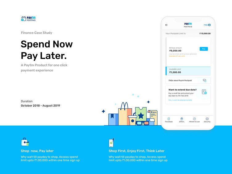
Paytm Postpaid - Buy Now Pay Later
📱 Introduction: In a world where seamless transactions and financial freedom are paramount, the Paytm Postpaid project stands as a testament to innovation and convenience. This case study delves into the design journey behind the creation of an unparalleled digital financial solution that empowers users with the flexibility to manage their expenses effortlessly.
🌟 Project Goals: The primary goal of the Paytm Postpaid project was to introduce a feature that reimagines the way users approach their daily transactions. By combining the power of technology and finance, the project aimed to provide users with an alternate mode of payment that allows for ease and convenience, eliminating the need for immediate out-of-pocket transactions.
💡 Key Features:
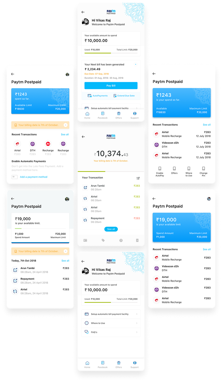
Instant Activation: Users can easily activate their Paytm Postpaid account within the app, eliminating the hassle of traditional paperwork and lengthy verification processes.
Seamless Integration: The design ensured that Paytm Postpaid seamlessly integrated with the existing Paytm ecosystem, creating a fluid experience for users accustomed to the app.
Real-time Monitoring: Users are equipped with real-time insights into their spending patterns, helping them make informed financial decisions.
Flexible Repayment: The project allowed users to repay their dues within a flexible timeframe, enabling them to manage their cash flow according to their convenience.
Personalized Limits: Tailored credit limits were set based on user behavior, ensuring responsible usage and fostering a sense of financial discipline.
🎨 Design Approach: The design process embraced a harmonious blend of minimalism and functionality. The color palette exuded trust and reliability, leveraging shades of blue and green. The user interface was crafted to be intuitive, with a clear hierarchy guiding users through various stages of their Postpaid journey. The incorporation of animations added a touch of dynamism, making the experience engaging and user-friendly.
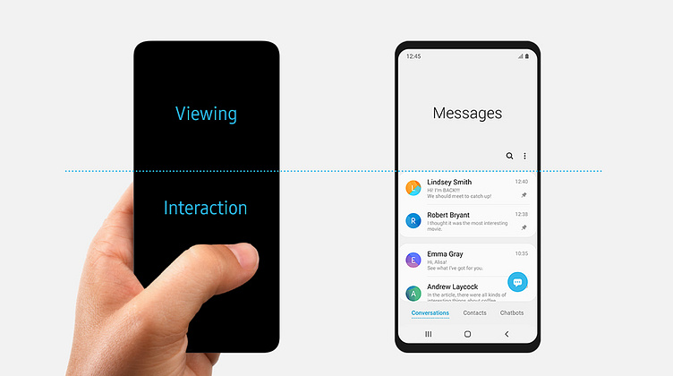
Accessibility First
I've always been a designer who always think of the accessibility for my users while thinking of any design. This is one of the examples I found out in the Samsung one ui 2.0 back in 2018. Which was a driving force in the project.
🚀 Challenges & Solutions
Risk Assessment: Balancing financial access with responsible lending was a challenge. The solution was to employ advanced algorithms for risk assessment, ensuring credit was extended to eligible users.
Security Concerns: Handling sensitive financial information demanded the highest levels of security. Implementing robust encryption protocols and biometric authentication ensured data remained confidential.
📊 Outcome: The Paytm Postpaid project revolutionised the way users approached their financial transactions. The feature garnered a significant user base within the initial months of launch, with overwhelmingly positive feedback about its simplicity and utility. Users appreciated the control it offered over their finances, leading to increased user engagement and trust in the Paytm platform.
🌈 Conclusion: The Paytm Postpaid project stands as a testament to the power of innovation in the fintech landscape. By marrying seamless design, advanced technology, and responsible lending, it showcases the potential to transform daily transactions into a stress-free experience. This case study sheds light on the iterative design process that resulted in a feature that redefines convenience, ultimately enhancing the lives of millions.
Dashboard Quest
At that time I was very much into storytelling and figuring out the process of how story has been made. I was also enrolled into Masterclass of Hans Zimmer and Neil Gaiman. As I was exploring the designs I wanted my Landing page of the product to look and feel different. Like how you write a main character. Everything else is just a support if you are able to make your main character engaging. That's why I was going through multiple designs, Only for Dashboards.
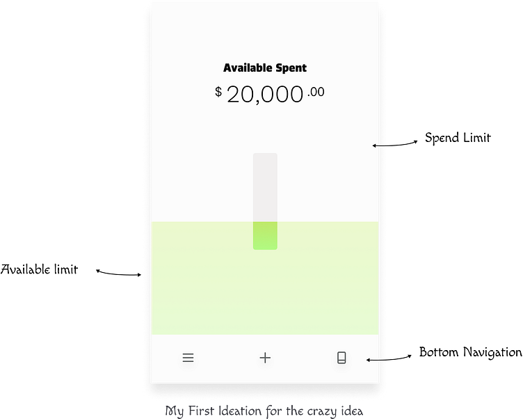
Bottle Metaphor
Actually the idea came when I was out drinking with friends and I found out a way to incorporate gamification to the Idea.

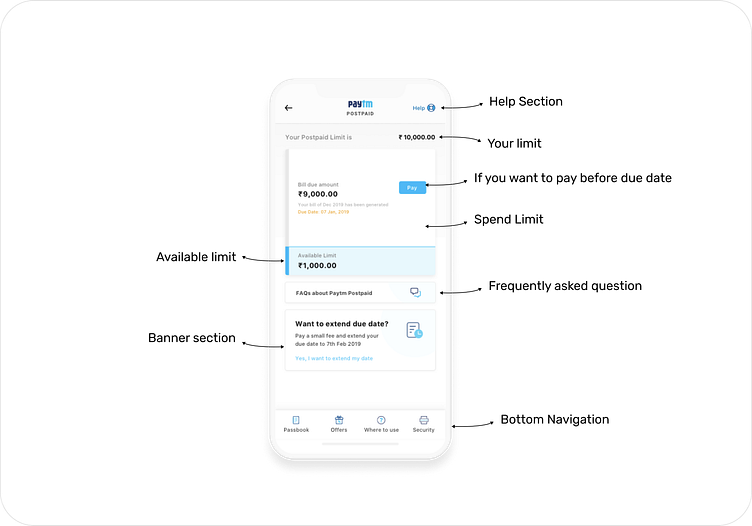
Everybody liked the metaphor but needed to think through the design so I came up with this container Idea. Just for the ideation for the container.
📱 Introduction: In a world where seamless transactions and financial freedom are paramount, the Paytm Postpaid project stands as a testament to innovation and convenience. This case study delves into the design journey behind the creation of an unparalleled digital financial solution that empowers users with the flexibility to manage their expenses effortlessly.
🌟 Project Goals: The primary goal of the Paytm Postpaid project was to introduce a feature that reimagines the way users approach their daily transactions. By combining the power of technology and finance, the project aimed to provide users with an alternate mode of payment that allows for ease and convenience, eliminating the need for immediate out-of-pocket transactions.
🎨 Design Approach: The design process embraced a harmonious blend of minimalism and functionality. The color palette exuded trust and reliability, leveraging shades of blue and green. The user interface was crafted to be intuitive, with a clear hierarchy guiding users through various stages of their Postpaid journey. The incorporation of animations added a touch of dynamism, making the experience engaging and user-friendly.
Impact
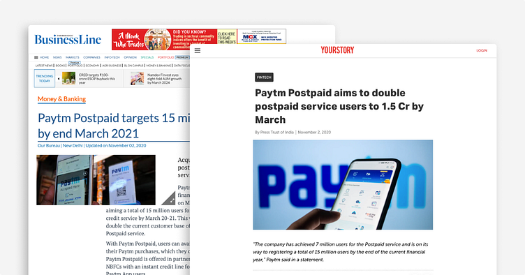
Paytm Postpaid disbursements at ₹4,050 crore saw a massive scale up, surging 449% YoY and 20% QoQ. The growing popularity of Paytm Postpaid is marked by the signed-up user base now crossing 6 million, and is widely accepted at over 15 million online and offline merchants. - Livemint