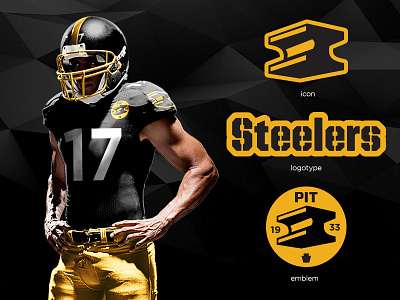
Steeler redesign/rebrand (for fun)
The 2015 season is upon us and I've got football on the brain! This is a redeisgn/rebrand that I've wanted to do for a while to mix things up (UI/UX gets a little old all day every day) and I've always felt weird that the US Steel logo and the Steeler icon were so interlinked. To me that's like having Lebron's branding on the Browns' helmet!
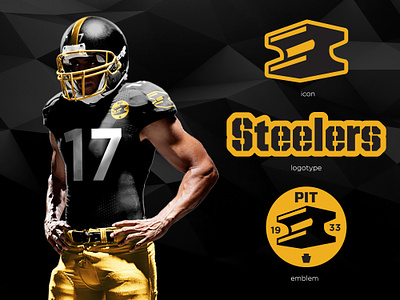
Anyway, the icon rework goes back to the "steely mcbeam" logo from the 60s minus steely mcbeam. This keeps the concept synonymous with the idea of "the steel city" w/o using the commercial brand logo.
The logotype is a reworked version of House Industries' United. It has a higher x height and rounded corners for a softer feel and echos the style of the current version. All other type is Gotham... b/c I love Gotham.
The emblem pulls together the steel icon, 1933 (year the team was founded), the city of Pittsburgh, and the keystone icon which represents Pennsylvania. A simple yet clear badge of what the team is and where it comes from.
Props to adam (dmhtfld) on deviantart.com for the great uniform templates!

