elm.leblanc logo redesign
---------FR-
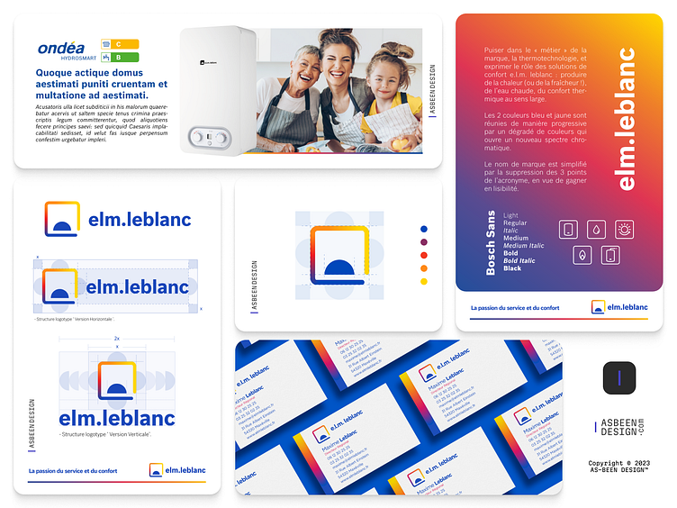
J'ai eu l'honneur de collaborer avec un des plus grands fabricants français de solutions thermodynamique elm Leblanc. La première usine est construite en 1963.
Ma mission était de redesigner l'ancien logo, 3 directions artistiques étaient proposées, et ce que vous voyez au-dessus qui a retenu l'attention du client.
Puiser dans le « métier » de la marque, la thermotechnologie, et exprimer le rôle des solutions de confort e.l.m. leblanc : produire de la chaleur (ou de la fraîcheur !), de l’eau chaude, du confort thermique au sens large.
Les 2 couleurs bleu et jaune sont réunies de manière progressive par un dégradé de couleurs qui ouvre un nouveau spectre chromatique.
Le nom de marque est simplifié par la suppression des 3 points de l’acronyme, en vue de gagner en lisibilité.
--------EN-
I had the honor of working with one of France's leading manufacturers of thermodynamic solutions, elm Leblanc. The first factory was built in 1963.
My mission was to redesign the old logo, 3 artistic directions were proposed, and what you see above caught the client's attention.
Drawing on the brand's "business", thermotechnology, and expressing the role of e.l.m. leblanc comfort solutions: producing heat (or coolness!), hot water, thermal comfort in the broadest sense.
The 2 colors, blue and yellow, are gradually brought together in a color gradient that opens up a new chromatic spectrum.
The brand name has been simplified by removing the 3 dots from the acronym, to make it easier to read.
Please share your thoughts about this. And don’t forget to Press “L” 💙 to support my shot.
I'am in Instagram