Hadiyat
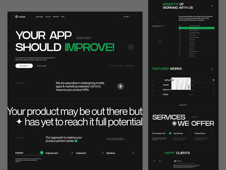
Many months have passed since I uploaded any new shots on Dribbble. Due to inactivity, I haven't given enough time to the platform. A couple of months ago, I had the opportunity to design the website for Hadiyat. Unfortunately, this website will not go live in the near future. However, I wanted to share this design with you all.
Here are some insights about the design: As you can see, this website focuses on oversized and bold typography. I used the color green, which represents growth, to create a positive mindset for the user who will benefit from taking the services of this agency or who will have their business growth boosted by this agency. I kept the design minimalistic, which would help emphasize the content and make it easier for users to navigate.
🍕 Say Hello at shakibali778@gmail.com
If you like this shot, hit "L💖" on the keyboard. Leave a comment to inspire, and follow me to get more shots like this. Check out my other work. Thanks 💙
👉 Follow Me on
