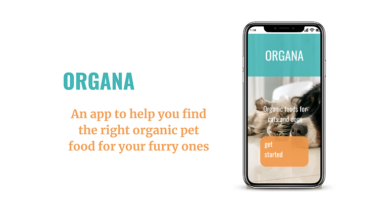
ORGANA
Elisabeth Donovan
About: Google Certification Project
Role: UX Designer
Duration: 2.5 months (10-20 hours a week)
GOALS
Users need an easy, fast way to find healthy, organic food for their pets. Our app will provide a simple way for pet owners to make these healthy choices.
RESEARCH METHODS
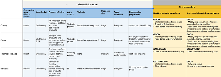
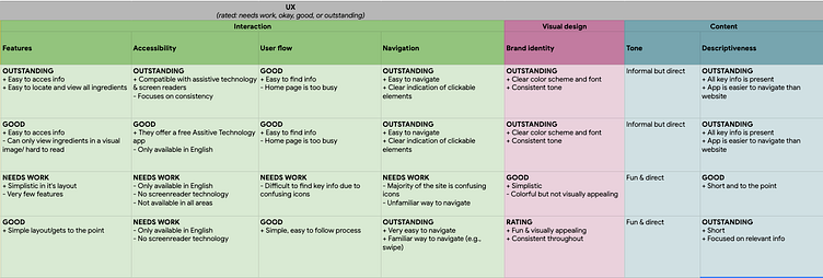
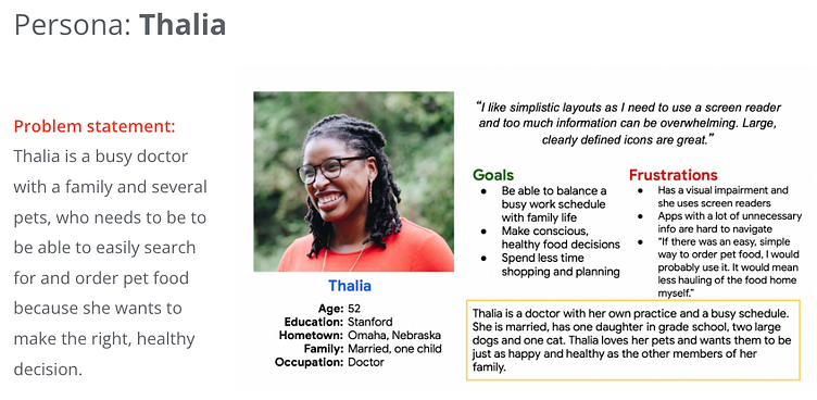
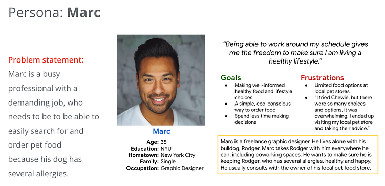
Using the data obtained by my Competitive Analysis, I was able to create User Personas to help me focus on the user journey.
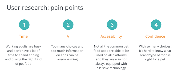
I conducted interviews and created Empathy Maps to understand the users I am designing for and their needs. A primary user group identified through research was working adults between the ages of 30-60 with busy schedules and less time to spend researching healthy pet food options.
This user group confirmed initial assumptions, but research also revealed that time was not the only factor limiting users. Other user problems included being confused and overwhelmed with options and information, needing advice, and confidence in making the right choice.
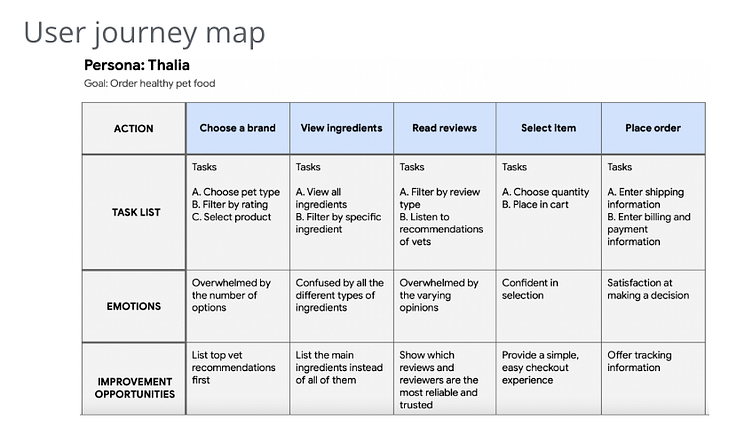
The User Personas I created helped ground me in my development phases, reminding me who ORGANA is designed for. I constantly referred back to their journeys & user flows throughout each iteration to help layout the direction of my app and keep focus on the needs of the user.
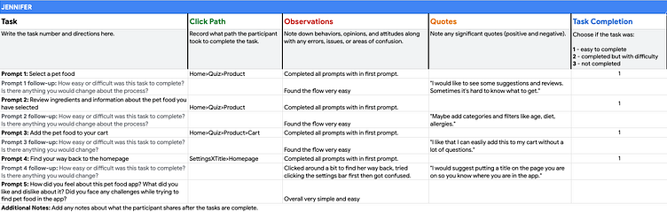
Once I had my designs ready, I ran the first of two Usability Tests. I performed two remote and three in-person tests, all moderated. This aided in pointing out the high priority issues that I needed to fix first, such as navigation, icons, and adding to cart.
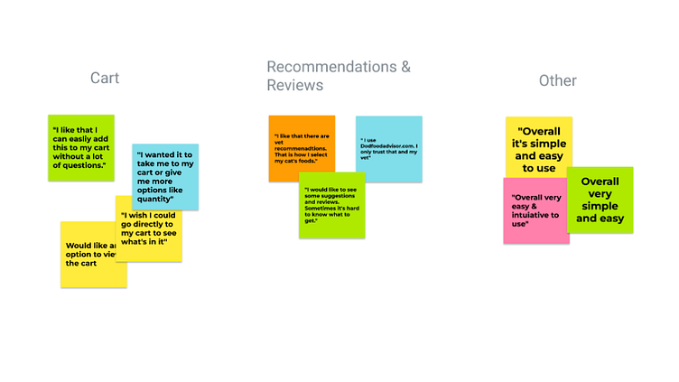
Once I had my usability test results, I created an Affinity Map with the results to see what areas to focus on and what improvements were most necessary. This is where I discovered that most users expected to be shown a screen to preview items before adding to their cart and the navigation I originally used to go back to the home screen was not intuitive.
WIREFRAMES
LOW-FIDELITY
I began the process by doing different quick iterations of a screen in the app before deciding on the final look. The final version was a polished combination of the best of each iteration.
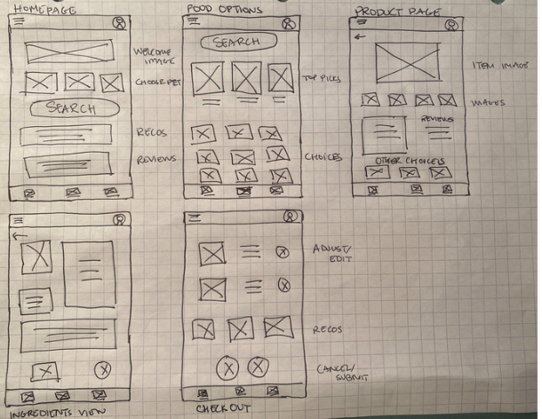
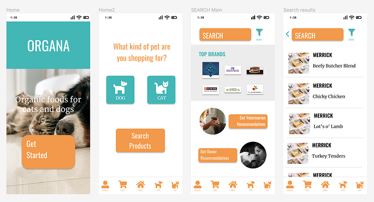
I learned through User Interviews, that people search for products in different ways. Because of this, I made sure to provide a few different starting points to suit the needs of the user.
MID-FIDELITY
This is where the usability testing came into focus. For each Usability Test I conducted, I gained valuable feedback from my targeted users. I would ask users to complete certain tasks unassisted, in a monitored environment.
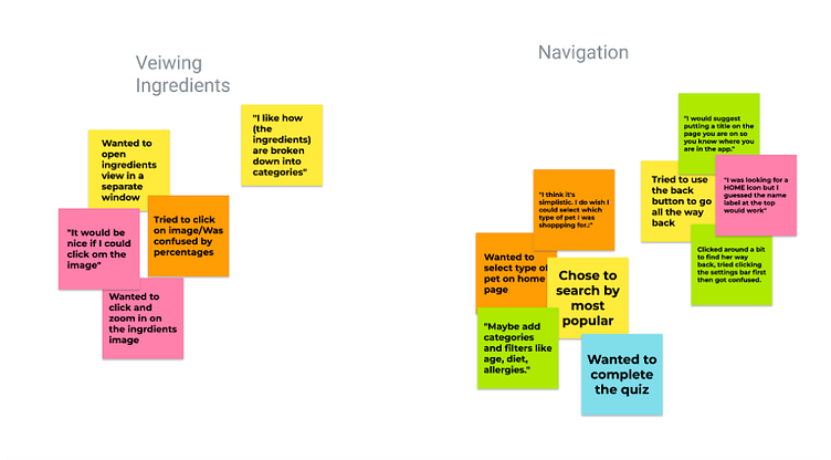
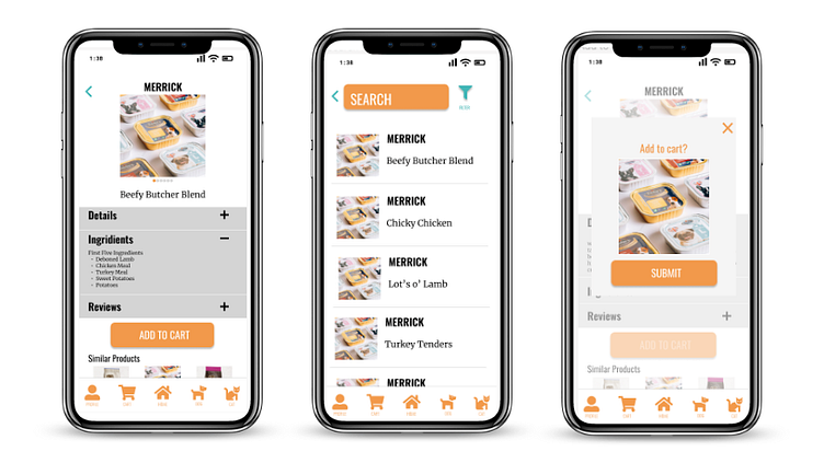
Since this app is designed to help users with making the right food choice, I needed to focus more on the product page. To make the most of small screen space, I added drop down lists and pop-up windows, so I could make sure all the relevant information and ingredients were easily accessible to my users.
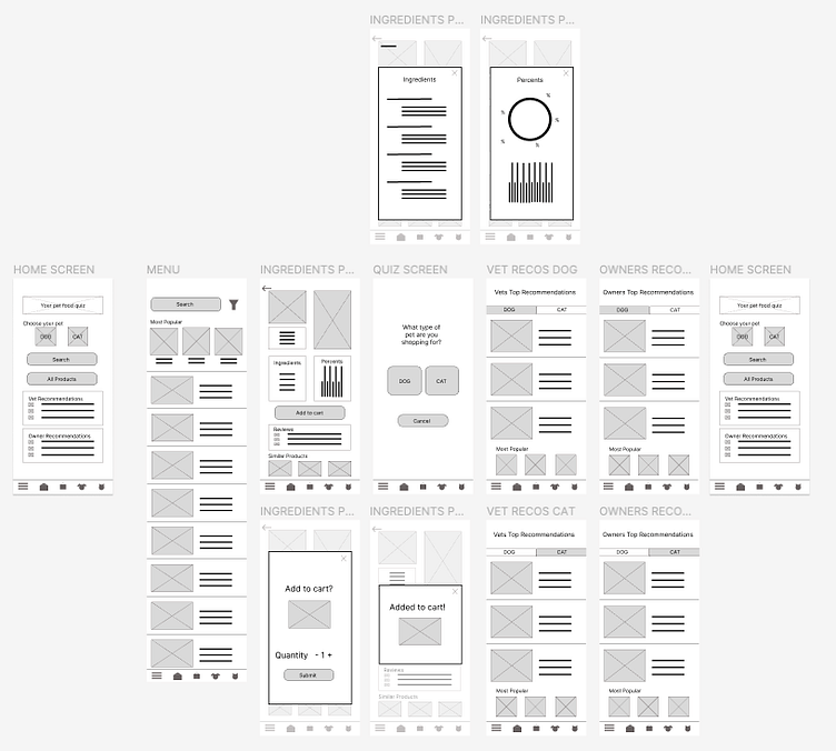
Throughout my first few iterations, I was designing a Top Nav Bar. I learned that most users did not understand that this was the path back to the Home Screen and found navigating back difficult. This was not ideal for a mobile app and was later changed to static Bottom Nav Bar with more universally recognizable icons.
HIGH-FIDELITY
Another fix was adding a cart preview. During my testing, I found that the majority of users felt a break in the user flow when the added the product to the cart and they were not given additional options or a chance to preview before agreeing.
ACCESSIBILITY
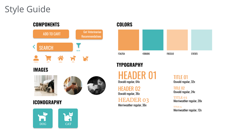
ORGANA uses simple and concise language for easier translation to the users main language. Text is used along side images in order to allow for screen reader assistance. Contrasting colors will allow users with visual impairments to more easily view and use the app.
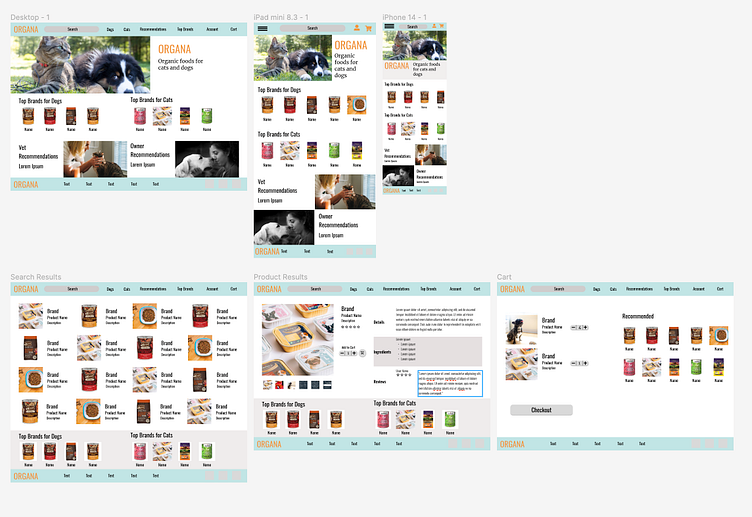
RESPONSIVE WEB VERSION
WIRE FRAMES
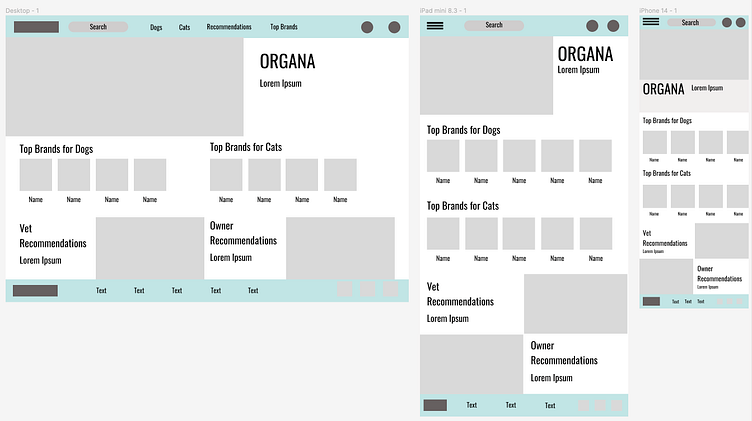
HIGH-FIDELITY
STYLE GUIDE
FINAL MOCKUPS
The end product is a fun and simple app that will help users be confident in their choice of pet food.
You can view the full prototype here
You can view the Responsive Web prototype here
PROJECT LESSONS
Test, test, test! As this was a student project, I was limited in my test participants. Still, the feedback and ideas I learned were invaluable in my design journey. Each test revealed something new and I am confident more user testing would only help make ORGANA better.
Iteration is everything. Every time I worked on a screen it got better, and I got more excited. Being able to learn, grow, and make changes that show that is thrilling for me. This was my first UX project after a brief hiatus, and each time I was able to iterate on a new idea reminded me why I am changing careers.
Feedback is not criticism. This UX course relied solely on feedback from fellow students, and I got plenty of it. I had to make sure to remember that feedback is a huge part of UX Design, and that this is not a criticism of me and my work. I am confident that because of all my fellow students feedback, I have grown significantly.
