NASB Logo Design
Concept:
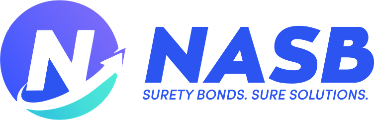
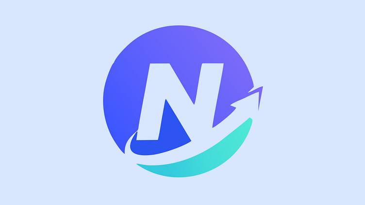
The logo for NASB - North American Surety Bond, represents trust, reliability, and financial security. It encapsulates the essence of the company as a reputable provider of surety bond solutions in North America. The design emphasizes the assurance and peace of mind that clients can experience when partnering with NASB for their bonding needs.
Shape:
The logo incorporates an arrow as its central shape, symbolizing protection, strength, and safety. The full circle presence conveys NASB's commitment to safeguarding its clients' interests and assets throughout their collaboration.
Color:
The logo features a bold and sophisticated color palette. Deep blue exemplifies stability, professionalism, and trustworthiness, while a touch of green highlights adds a sense of prestige, representing the high level of service NASB offers to its clientele.
Typography:
A strong and dignified sans-serif font is chosen for the typography. The letterforms exude confidence and credibility, reflecting NASB's solid reputation in the surety bond industry.
Icon:
The sleek and streamlined arrowhead represents NASB's role in leading clients towards success, while the tail signifies protection and security—the assurance that NASB provides throughout their partnership.
Negative Space:
Ingeniously, the negative space within the arrow forms the letter "N," subtly highlighting the North American focus of the company's services.
Simplicity:
The logo maintains a clean and straightforward design, ensuring instant recognition and memorability. The simplicity reinforces NASB's dedication to clarity and transparency in their bond offerings.
Versatility:
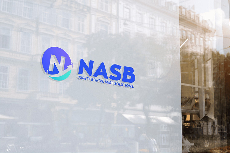
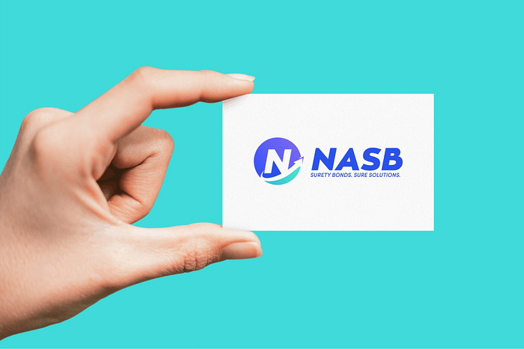
The logo is designed to be versatile, easily adaptable to various marketing collateral, stationery, digital platforms, and promotional materials. It maintains its visual impact and legibility at different sizes and across diverse applications.
Final Touches:
Subtle gradients and shadows are applied to the shield and icon to create depth and dimension, adding a contemporary touch to the design. These details contribute to the logo's sophisticated and polished appearance.
In conclusion, the professional logo designed for NASB - North American Surety Bond, conveys a sense of trust, security, and authority, positioning the company as a leading player in the surety bond industry. The logo's thoughtful symbolism and refined aesthetics speak directly to NASB's target audience, reinforcing their confidence in choosing NASB for their surety bond needs.
Like it? 💗 it.
We greatly appreciate your support and would love to hear your thoughts on this project.
Interested in partnering with us on your next project?
Send us a message, and let’s discuss how we can assist you. Drop us an email at projects@xclamatory.com if you would like to talk about creating a brand or a digital product.
More about us on xclamatory.com