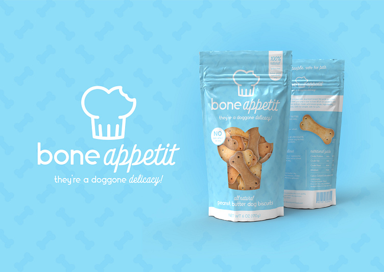
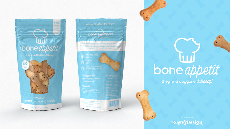
Bone Appetit - Logo & Packaging Design
Not a real brand - this is a design artwork to further my skills in packaging design.
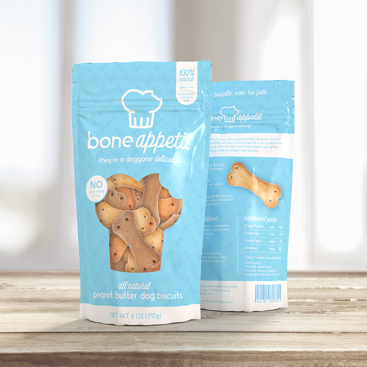
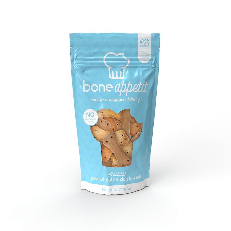
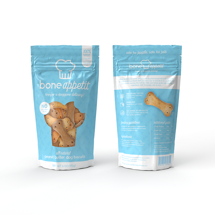
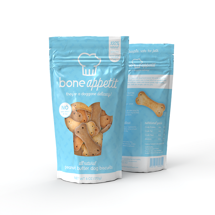
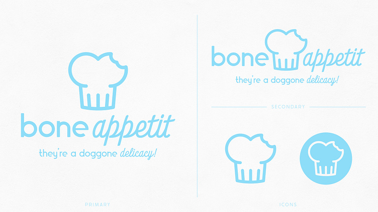
I began with the logo and went through a few name variations before deciding on Bone Appetit and then I proceeded to choose my fonts and then create my icon. For the icon I created a simple bone shape and then altered it to look like a chefs hat. After some thought I decided it needed something more, so I added the bite in the upper right to give it some added visual interest.
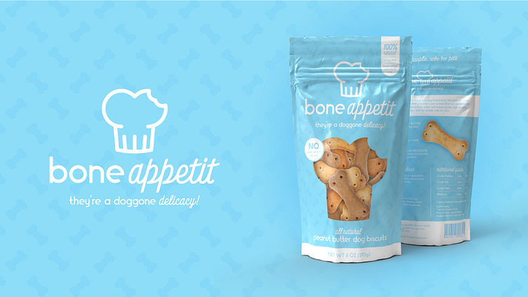
Once I was happy with the logo I set out to create the packaging for my make believe dog treat brand. My first step was to research and see what my "competition" was doing. Eventually after viewing practically every dog treat packaging design to have ever been created, I felt sufficiently inspired and was ready to try it out for myself. I began by playing with a few different layout designs and once I was happy with my choice I chose my color scheme. I knew that I wanted a very minimal color scheme, that way if my hypothetical brand ever became a reality, I could easily change the color scheme to fit with any new treat flavors. I thought the blue and white was both professional and inviting, and the minimal color scheme would be sure to stand out against the competition.

When it came to populating the design I based all of my information off of other dog treat brands, as I am not at all qualified nor have the desire to create and then equate all the nutritional information for a hypothetical dog treat design.
All in all, I think this is a fun design and I honestly had such a great time designing it. If there is anyone in the market for a dog treat company and need a name, logo and packaging design, this one is available!