Logo Design | Dairy Brand Logo
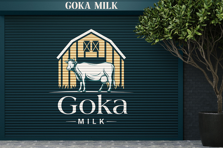
The "Goka" 🐄 dairy brand logo showcases a perfect blend of simplicity and charm, capturing the essence of nature's bounty and the goodness of dairy products. At the heart of the design stands a friendly and endearing cow, lovingly gazing at the viewer, symbolizing the brand's strong connection to nature and its commitment to providing wholesome and natural dairy products. 🍃🥛
The cow's silhouette is gracefully outlined, exuding a sense of elegance and sophistication, while the gentle curves and rounded edges add a touch of playfulness, making it instantly relatable to people of all ages. The cow's features are soft and inviting, evoking a sense of trust and reliability, assuring consumers of the brand's dedication to producing top-quality dairy delights. 😊🧡
Embodying the colors of nature, the logo's palette is a harmonious blend of creamy whites, warm earthy tones, and hints of lush green, creating a sense of freshness and purity. This color scheme reinforces the brand's commitment to using only the finest, farm-fresh ingredients in their products. 🌾🥚🍦
The word "Goka" is gracefully incorporated below the cow, written in a clean, modern font that complements the logo's overall design. The font's fluidity suggests a sense of fluidity and movement, symbolizing growth, progress, and the brand's dedication to continuous improvement. 🏞️🚀
Overall, the "Goka" dairy brand logo is an inviting and memorable representation of a brand that prides itself on providing nutritious and delicious dairy products, establishing an instant connection with consumers and leaving a lasting impression in the dairy market. 🏆🥰
🔥 If you want to see more cool designs like this, follow us now! 🔥
