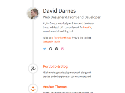
darn.es Revision 2 Design

Revision 2 of my "top level" site. Taking on board another set of great feedback.
The only thing I'm unsure about is the link colour for the first two sections. Is it readable? Seems like a strong colour which I like but hesitant to use as I'll be using it for my portfolio site too. Plus point, you don't see this colour used often and it sets it apart from commonly used colours like twitter or facebook blue and muted green.
Hit x2 or the attachment to see more.