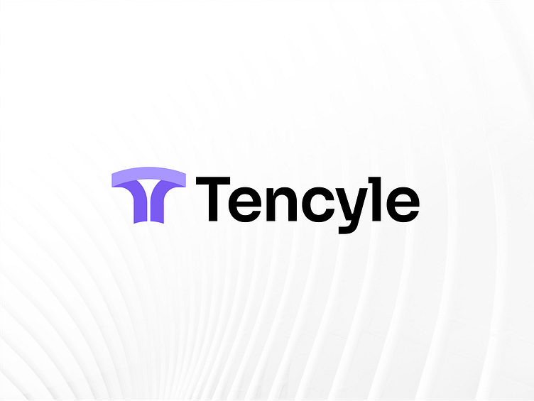
Tencyle - Logo Design
Tencyle - A cyber security company - A minimalist logo design based on the letter T, cleverly stretching its form to symbolize the company's inherent elasticity.
With a minimalist touch, the logo captures the essence of the company's flexibility. The letter T is gracefully elongated, subtly emphasizing the brand's adaptive and malleable nature. The clean lines and uncluttered design evoke a sense of modernity and sophistication.
In this emblem, the elongated T subtly implies that the company can stretch and adapt to meet its customers' ever-changing needs. Its simplicity and elegance convey a sense of professionalism and reliability.
Overall, the logo perfectly reflects the company's core values, showcasing its ability to embrace change while maintaining a strong and recognizable identity.
Interested in getting your logo design or branding done?


