Dial Pad
Hey guys,
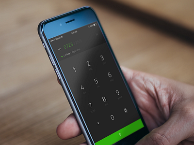
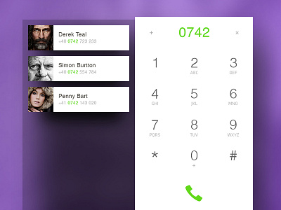
Today I did a rebound on a dial pad. Have you asked yourself why do we use the earphone icon? Maybe someday your kid will ask you "what is this icon about", if it didn't happen already :)
How about a different approach? The vibrant color is the best indicator ever. Green for calling, red for hanging up. Combining it with precise swiping gestures can do miracles, especially when you don't want to act by mistake and call a random number, let's say.
In my concept, everything is gesture based:
- Swiping up on about 30% of the screen expands the button and initiates a call.
- Swiping the top bar to the right gives you access to "Add contact" screen
- Swiping it to the left deletes the written number
- Swiping down finishes the number, as it's shown on the autocomplete, and calls Peter in our case.
So, this shot was a quick one. If you are interested, I can do a rebound with more screens and hopefully, some sweet animations.
Check out the attachment, press "L" and spread the love :)
------------------------------------
About the challenge:
As most of you, probably, I have hard times keeping my Dribbble activity high and post regular shots. I am following Paul’s Daily UI Elements challenge for quite a while now and I’ve enjoyed every pixel out of it. So I’ve decided to join Paul’s challenge and start designing one UI element each day. This dedication will be a great way to return the favour and inspire the community, and a good excuse to practice and experiment with random design components.
Feel free to follow through and join in!
#daily100 #daily007


