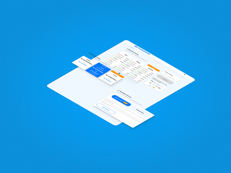
Niagahoster Checkout Flow Revamp
I want to share my recent work as part of Rakamin's study case project where I managed to revamp one of the most popular cloud hosting service in Indonesia, Niagahoster.
The Problem
According to their research findings, most users are confused with Niagahoster's plan information as they claimed it to be "too technical". Another finding stated that most users are frustrated due to the many steps to be taken on their checkout page. These two problems lead to the cancellation of their checkout process.
Design Attempt
Therefore, I managed to redesign their checkout flow to be more seamless. I also use less technical language that is easier to comprehend. You can check the design below.
Thank you for reading through my shots! any feedback are welcome :D
I'm open to any UI/X project.
If you're interested in my design, you can hit me up through this email: adalvin12@gmail.com

