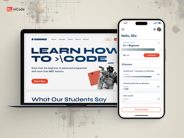
Online Coding School UI/UX Design for Desktop & Mobile
Hey Dribbblers! 👋
Excited to share our latest UI/UX design for the online coding school for desktop & mobile users! 💻📱
🎯 Goal:
The main focus of this design was to create an engaging and intuitive learning experience for aspiring coders and seasoned developers alike. Our aim is to make learning to code a seamless and enjoyable journey, with an emphasis on hands-on practice.
💡 Key Features:
Personalized Dashboard: The sleek dashboard allows users to track their progress, view upcoming courses, and access their coding challenges. With an eye-catching progress chart, learners can easily visualize their growth.
State-of-the-art coding playground that supports multiple programming languages.
Teachers & Live Sessions: Coding connects students with top-notch instructors for live coding sessions, Q&A, and code reviews. Our dynamic interface ensures seamless interaction between instructors and learners.
🎨 Design Highlights:
In terms of design, we opted for a clean and modern look with a vibrant color scheme to keep learners engaged and motivated.
Blue is often associated with trust, professionalism, and reliability. It instills a sense of confidence in the users, which is crucial for an educational platform like a coding school. Orange, on the other hand, is an energetic and attention-grabbing color that can stimulate enthusiasm and creativity. This combination creates a balance between stability and excitement, making the learning experience engaging yet credible.
The intuitive navigation and clear hierarchy of elements ensure a smooth learning experience.
Press "L" to show some love and stay tuned for more updates! 🤩
Cheers, inCode Systems 🙌
Enter your text here...
