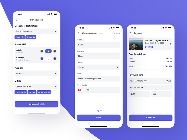
Yacht trips app | Destinations/Account/Payment screens
🚶 Each journey consists of multiple steps, and when it comes to applications we ensure that users can clearly see the route ahead and know when they’ll reach their destination.
Intuitive, brief, and clear — that’s what we aimed for with our latest UI. Minimalist color scheme, simple menu structure, and no obstacles to stand between your users and their travels.
Looking for a modern and user-friendly design?
✅ Book a call with our Founder
✅ Contact us here
More by Zoftify — Travel UI/UX View profile
Like

