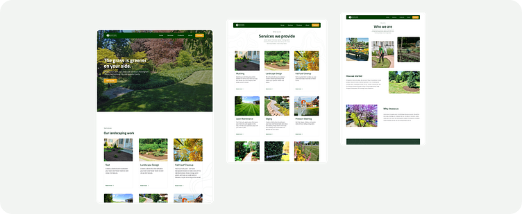
Lawn & Landscape Case Study
The Brief
Our objective was to undertake a comprehensive website redesign project. Following an in-depth consultation with the client, we meticulously compiled a list of their requirements to ensure the revamped website met their expectations.
The key elements included:
-a prominent call-to-action on the homepage
-an informative display of services and products
-an engaging "About Us" page
-streamlined FAQ and Contact pages
-multiple homepage design options inspired by the client's preferred websites
-incorporation of client-provided visuals
I played a pivotal role in translating the client's vision into a visually engaging and user-centric design. Through wireframing, prototyping, and close collaboration with the client. I created seamless user experiences that aligned with the project objectives.
The Process
After an initial meeting to gather all necessary details, I conducted research on similar landscape websites and created a mood board. Using this as inspiration, I created three different wireframes for the home page. Once the client approved the wireframe, I started on a component library and developed the rest of the pages in Figma. Throughout the process, I worked closely with the client, reviewing the designs together and making necessary iterations. We had a final review with the client and then moved on to building the website in Framer.
The Result
As a result, I was able to effectively collaborate with a client to bring their vision to life. The client expressed great satisfaction with the new layout, which they found to be more user-friendly, aesthetically pleasing, and, most importantly, reduced the number of daily calls. The enhanced functionality allowed for smoother and more efficient navigation. Additionally, the redesign provided a fresh and modern look that attracted more visitors and helped solidify their brand image.


