Car automotive brand gold black print flyer poster design
Crafting a gleaming identity: the design journey with premium mobile carcleaning
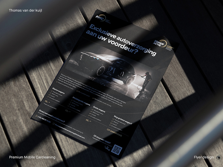
As an experienced graphic designer, working with Premium Mobile Carcleaning has been a rewarding and inspirational journey. The task at hand was not just to portray their exceptional mobile car cleaning services visually but to encapsulate the unique ethos of Premium Mobile Carcleaning and their commitment to customer satisfaction through design.
For Premium Mobile Carcleaning, washing cars transcends a mere routine task. They pride themselves on transforming this everyday chore into an art form, utilizing advanced washing and drying techniques that safeguard a car's paintwork from scratches and damage. This underlying principle was the central theme I elected to spotlight during the design of the Premium Mobile Carcleaning flyer and logo.
The color palette of Premium Mobile Carcleaning – black, white, and gold – was a conscientious choice. Black and white offer a striking contrast, denoting professionalism and providing an attention-grabbing backdrop. The touch of gold infuses an element of prestige and sophistication, underscoring the 'premium' in Premium Mobile Carcleaning.
Typography is an integral part of any design, and for Premium Mobile Carcleaning, we settled on a modern, sans-serif typeface. This choice communicates a sleek, contemporary vibe that mirrors the advanced techniques employed in Premium Mobile Carcleaning services.
In addition, the design needed to resonate with the work philosophy of Premium Mobile Carcleaning. I chose to incorporate elements that reference their processes within the logo. The curves of the logo mimic the contours of a soap bubble and water – two fundamental components in car washing. This design decision fosters a subtle but powerful connection with the observer, immediately conveying what Premium Mobile Carcleaning does.
This same rounded design element was incorporated into the flyer's background and the call-to-action for the summer campaign. This continuity plays a vital role in creating a coherent brand identity for Premium Mobile Carcleaning, tying the different components together seamlessly.
The primary goal of the flyer is to persuade potential customers to utilize the services of Premium Mobile Carcleaning. Therefore, the content was strategically presented, directing the viewer's attention to the critical benefits of engaging with Premium Mobile Carcleaning. The professional but engaging tone captivates the reader, firmly conveying the message: Premium Mobile Carcleaning can make your car appear brand new, no matter your location.
As we progress, I am excited to continue creating more design elements, such as business cards, for Premium Mobile Carcleaning that resonate with their brand ethos. By meticulously considering each design choice, we can ensure that the visual identity of Premium Mobile Carcleaning remains as premium and sophisticated as the services they deliver.
___________________________________________________________________________________
Let's team up and elevate your brand with Dutch Design!
Don't hesitate to get in touch with me via E-mail:
🚀 info@thomasvanderkuijl.com
💼 Let's link up on LinkedIn and take our professional networks to the next level!
📷 Join the Insta-party and catch my latest projects today!
