Gardening nature eco flyer design project
Green impressions: crafting an eco-centric flyer for Van Grasman
As a Graphic Designer, I have had the immense pleasure of working with Van Grasman, the premier knowledge hub for everything related to grass and lawns. This project encompassed various elements of design, most notably the creation of a compelling flyer aimed at enticing potential advertisers and those interested in link building to consider Van Grasman as their primary platform. This piece not only needed to align with the company's brand identity but also needed to resonate with the audience's interests and aspirations.
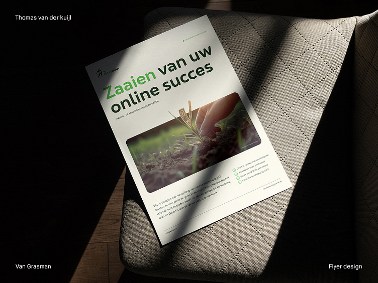
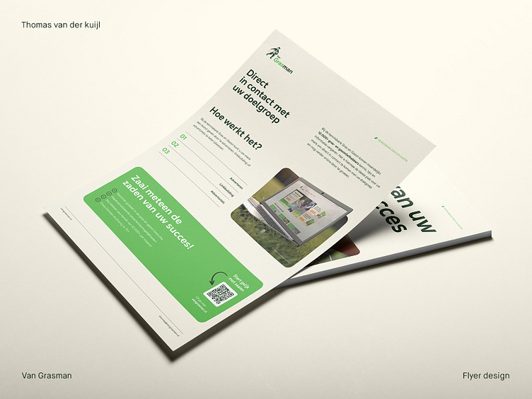
Starting with the color scheme, green and taupe were the primary colors utilized, as these are Van Grasman's brand colors. The use of green was a natural fit as it is synonymous with grass and lawns - the core subject matter of the brand. It instantly connects the reader with the nature-centric theme of the platform. The taupe color, on the other hand, served as a sophisticated neutral counterpoint to the vibrant green, creating a balance while adding an earthy feel that evokes a sense of groundedness and reliability, which is vital for the reputation of Van Grasman as a trusted source of information.
The selection of a modern, sans-serif typeface was another deliberate decision. Sans-serif fonts are widely acknowledged for their readability and versatility across both digital and print mediums, a factor that was crucial considering the flyer's intent to appeal to a broad audience. This modern typeface, free of unnecessary embellishments, aligns with Van Grasman's contemporary, user-friendly approach, underlining the ease of access and clarity of the information provided.
Content and layout also played pivotal roles. Given the flyer's purpose—to convince people to consider link building or advertising with Van Grasman—we needed to keep the message direct, yet engaging. To achieve this, we used persuasive language and clearly outlined the benefits of partnering with Van Grasman. The layout was carefully designed to guide the reader's eye, with call-to-action elements strategically placed for maximum impact.
The creative choices made throughout this project were not only guided by aesthetic considerations but, most importantly, by a deep understanding of Van Grasman's mission and audience. The result was a flyer that not only faithfully represented the Van Grasman brand but also effectively reached out to potential partners, communicating the unique benefits and opportunities provided by the platform.
It was a truly engaging project that required a nuanced balance of creativity and strategic thinking, and I believe it has successfully encapsulated the essence of Van Grasman while serving its specific purpose.
___________________________________________________________________________________
Let's team up and elevate your brand with Dutch Design!
Don't hesitate to get in touch with me via E-mail:
🚀 info@thomasvanderkuijl.com
💼 Let's link up on LinkedIn and take our professional networks to the next level!
📷 Join the Insta-party and catch my latest projects today!
