Tecedify - Logo Branding | Lightening Bolt | Lightening Bulb
Logo Exploration Description for "Tecedify" - Empowering Students Through Technology
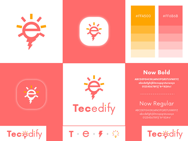
In the quest to visually capture the essence of Tecedify, a dynamic and forward-thinking technology company dedicated to empowering students, a comprehensive logo exploration was embarked upon. The logo is a harmonious fusion of symbolism, typography, and colors, all meticulously chosen to encapsulate the brand's mission and spirit.
Symbolism: The heart of the logo lies in its symbolic representation. The fusion of the letters "T" and "e" form the foundation, embodying Tecedify's identity as a nexus for technological enlightenment. The intertwined letters subtly convey unity, collaboration, and the interconnectedness that technology fosters. The curvature and alignment of the letters mirror the fluidity and adaptability of knowledge-sharing.
Lightning Bolt: A vibrant lightning bolt element emerges seamlessly from the "T," metaphorically illustrating the electrifying surge of innovation and inspiration that Tecedify imparts. This symbol not only alludes to the rapid pace of technological evolution but also symbolizes the spark of genius that ignites when students harness the power of technology.
Light Bulb: Situated within the counter of the letter "e," a meticulously crafted light bulb icon radiates a gentle luminance. Serving as a visual metaphor for ideas and enlightenment, the light bulb encapsulates the transformative energy that Tecedify brings to students' educational journeys.
Color Palette: The color palette, with "Inclusion Coral" and "Inspiration Orange," is not merely a visual choice but a deliberate narrative. "Inclusion Coral" resonates with the brand's commitment to diversity and accessibility, fostering an environment where every student is included and valued. "Inspiration Orange" radiates enthusiasm and zest, epitomizing the spark that fuels students' exploration and creativity within the realm of technology.
This logo exploration is a result of careful consideration and deliberate synergy. It stands as a visual manifesto of Tecedify's unwavering dedication to nurturing and propelling students forward through the limitless realms of technology. As Tecedify journeys onward, this logo shall stand as an emblem of inspiration, innovation, and the empowerment of students worldwide.
Typography: The choice of "Now Bold" and "Now Regular" fonts reflects the brand's balanced approach – boldness in pursuit of progress and clarity in communication. The typography exudes a modern and approachable aura, mirroring the company's ethos of accessibility and cutting-edge innovation.
This logo exploration is a result of careful consideration and deliberate synergy. It stands as a visual manifesto of Tecedify's unwavering dedication to nurturing and propelling students forward through the limitless realms of technology. As Tecedify journeys onward, this logo shall stand as an emblem of inspiration, innovation, and the empowerment of students worldwide.


