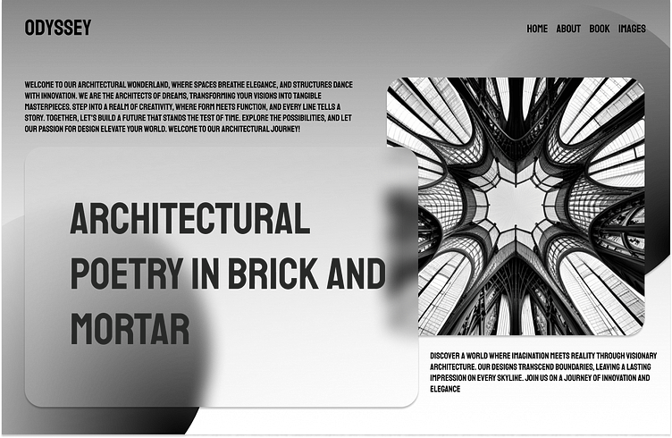
Landing Page for a Architecture website
Its day 3, I've learnt something new! , This is a landing page for architecture website .I used back and white color palette for this landing page. Here blurred components has been used. I used a minimal style which looks clean on the page
all the images that you see on this is page is AI generated
More by Alfred View profile
Like
