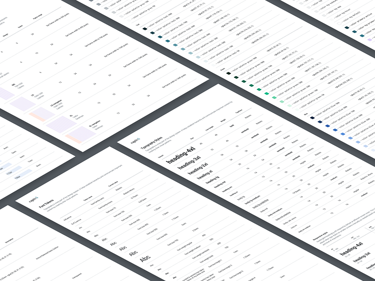
Captiv8 Design System: design tokens
Hi there,
At Captiv8, we have recently finished laying the groundwork for our Design System by incorporating Design Tokens into our daily workflow.
Design Tokens serve as a bridge of communication between developers and designers. They form any design language's foundation and are a vital communication tool. By providing a shared language between design and engineering, Design Tokens enable the detailed exchange of information about building user interfaces.
When building a Design System, the first step is to gather a complete inventory of all the system's elements, patterns, and user interface styles. Once this is accomplished, the next stage involves creating a solid foundation for the other sections of the Design System.
The following sections will be dedicated to the groups of tokens we build 👉
Colors
The foundation for color tokens comprises a primary palette that consists of eight colors, each with ten distinct shades. This palette is based on the CIELAB color model. However, this primary palette is not used directly in development.
We utilize a secondary level linked to specific element attributes to organize color tokens efficiently. To learn more about this process, please refer to the case study, where I explain how we integrated these color tokens.
Typography
The typography is also divided into parts. The first one is basic typography tokens, which describe the granule properties of any text, such as font family, font size and weight, and line height.
The next level involves creating font styles that group together several primary font attributes into a single class. It calls mixins in Sass and it's how Figma uses font styles.
Space
Space tokens can simplify decision-making and ensure consistent spacing between elements on a page layout. These tokens are created explicitly for horizontal and vertical spacing and can be applied in various contexts.
Border
The border tokens determine the elements' characteristics, including the border's radius and the stroke's width.
Shadow
These tokens are meant to convey the visual hierarchy and elevation of the elements.
Layout
Using layout tokens, you can create adaptive designs for specific elements and define modular grids across different resolutions. Our approach is rather classical, and we have five breakpoints: xs, sm, md, lg, and xl.
If you enjoyed reading this, please give it a thumbs up by clicking the (L) button and join me for more exciting content. I would love to hear from you about your thoughts on this project, so feel free to share them with me. Thank you, and cheers! 🤗


