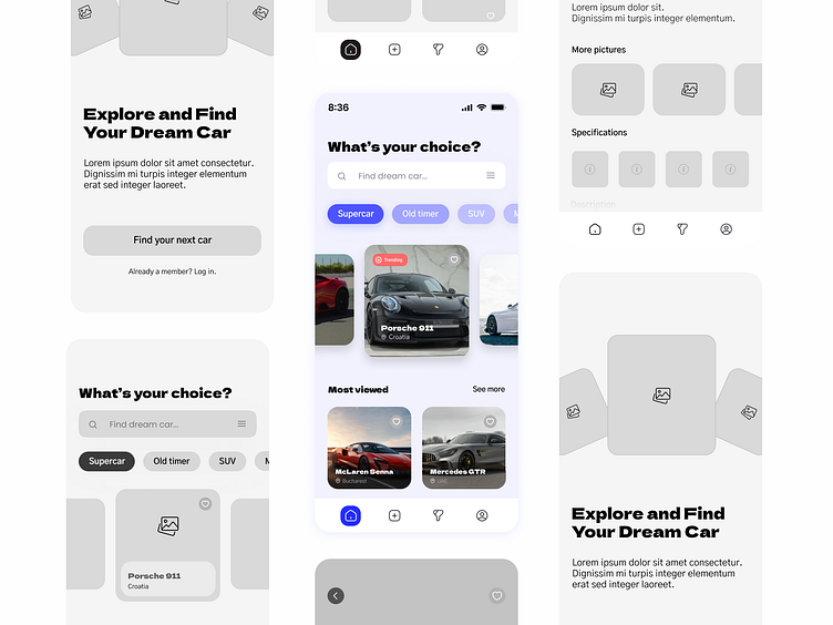
Carjava - Dream Car Finder App Showcase
Hello, everyone! 👋
This is a showcase of the entire design process for a mobile application used for car search.
What do you think? Take a look at the full showcase and let me know. And don't forget to leave a like; it means a lot. Thanks!
Introduction & goals 🏁
In today's world, purchasing high-end dream cars via apps is not a common practice. However, I strongly believe that with a design that exudes sophistication and offers exceptional organization, I can redefine the car-buying experience and attract users who demand nothing but the best.
With that in mind, I focused on creating a modern and highly intuitive design that will guide users seamlessly towards finding their dream car.
Through extensive UX research, I have identified several challenges faced by competitors' platforms. Many existing apps lack a clean and intuitive interface, making it difficult for users to navigate and browse through available cars.
Additionally, cluttered layouts and overwhelming visual elements often hinder users from quickly finding their ideal vehicles.
My goal was to revolutionize the car-search experience by addressing these shortcomings.
⌛️The Process
After conducting comprehensive research, I started working on the wireframe. My aim was to achieve maximum intuitiveness while ensuring that the UI design looks modern, adhering to all the standards of today's UI and UX design.
Screens 📱📱📱
I opted for a bright background combined with subtle blue accents. This color scheme not only gives the app a modern and sophisticated look but also enhances readability and ease of use.
The use of rounded elements, precisely set at 20px, adds a touch of elegance to the design, ensuring it remains contemporary and user-friendly.
I designed three pages for this exploration.
Onboarding page, the page a user sees when they open the app for the first time.
Home page, which contains the search bar, categories and all of posts.
About car page, a page where users can find all the informations about car they like.
📱Elements ⬇️
The rounded elements indicate the modernity of the design, and I, too, have incorporated curvature as a key aspect of modern design in this project.
Personally, I find it appealing as it adds a sense of refinement, which is essential for an application where luxury cars worth up to 2 million dollars are showcased.
Typography & colors 🔤
Final thoughts 🧠
My design bridges the gap between functionality and aesthetics. It is not just visually appealing; it solves real problems and pain points faced by users during the car search process.
By emphasizing simplicity and ease of use, I make sure that even those with considerable purchasing power will find joy in using the app to discover their perfect vehicles.
By focusing on functionality and problem-solving, I have crafted an interface that simplifies the car search process, making it enjoyable for users to find their dream cars.
The carefully selected color scheme, rounded elements, lightweight shadows, and ample white-space all contribute to a modern and intuitive user experience.


