B. A. Tinman
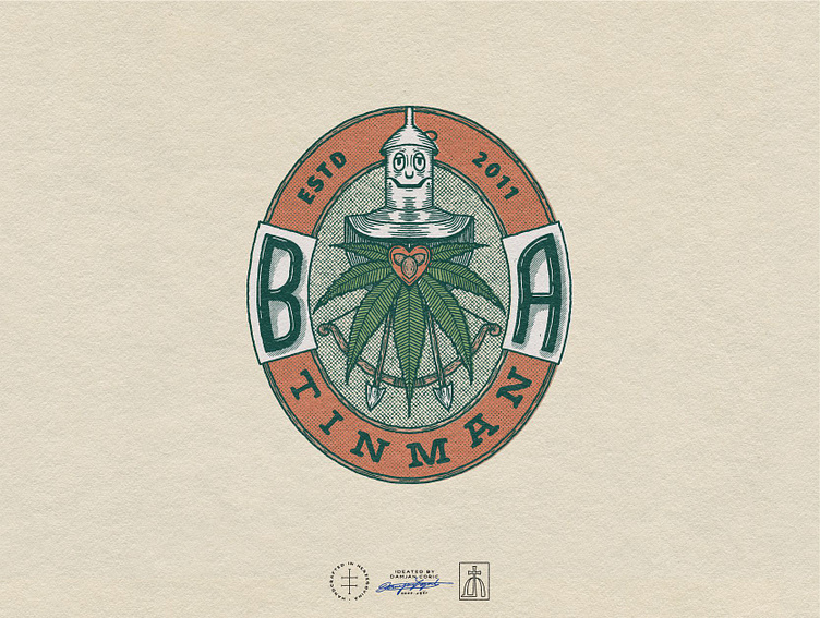
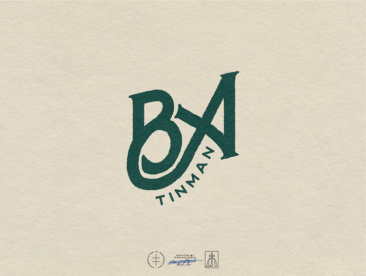
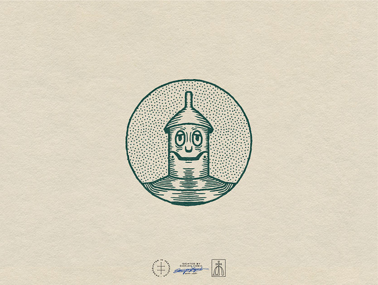
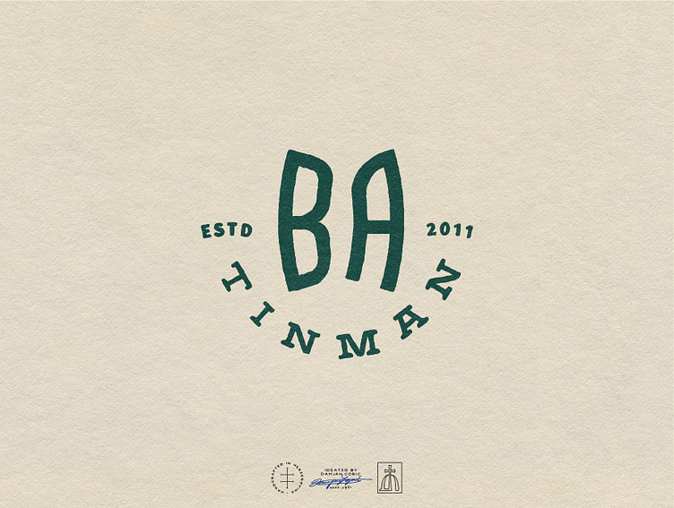
Logo system for a can*abis lifestyle brand out of the UK.
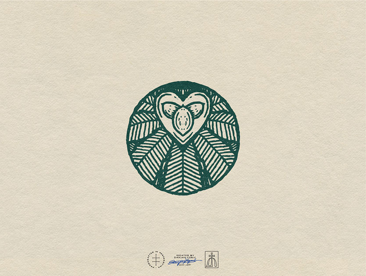
The client envisioned a classic logo that references the Wizard of Oz, the inspiration behind the brand’s name.
I created an intricate vintage emblem that features the Tin Man, a can*abis leaf & seeds, as well as a bow & arrows. The overall style is traditional and organic, supported by a muted, earthy color palette.
For the type, we went for funky hand lettering and a simple slab serif to convey a sense of confidence and dependability.
⭐️ Follow me for daily design inspiration!