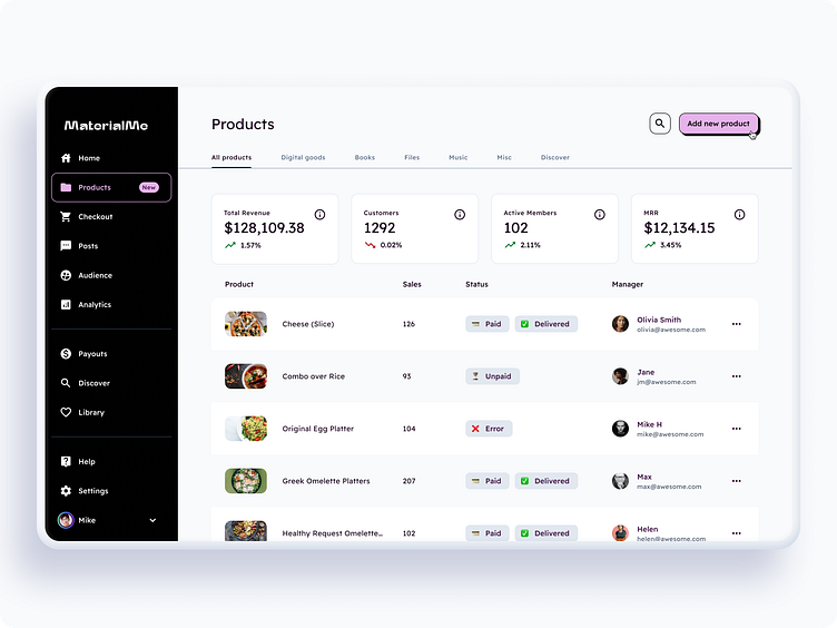
Dashboard / Analytics • Material You (m3)
I decided to do a small redesign of the dashboard, using components from the Material Me design system.
And I added a touch of playfulness by incorporating elements of neo-brutalism.
_____
Full Figma Preview: Pro version: 3.0
The foundation of Material Me is based on the new version of Google's Material You.
In my version of the design system, it is adapted for the web, utilizing the Tailwind palette and featuring a beta version of React components.
However, you can use any other component library as a base by simply modifying the styles you create with the design system.
I believe that with this design system, you can create absolutely any style. Rules are meant to be broken, so it is more of a tool that provides certain recommendations rather than limitations.
All components and template includes a light ⇡ and dark ⇣ theme.
Info
Material Me UI kit is a web-optimized design system with 3000+ variants for 39 components and 350+ ready-to-use app layouts crafted for Figma.
Based on Material Design 3 (new Material You) guidelines, this design system enhanced with Tailwind CSS colors and uses Readex Pro font, which is free and similar to Google Sans.
Each template inside is assembled for desktop, tablet & mobile viewports and represented within a range of color variations, including dark theme.
The React components based on design system are available, created using Next.js, Tailwind and TypeScript.
🔥 Product highlights
Material Design 3 system contains 39 categories of components. Represented by 3000+ variants and compatible with m3.material.io
Comes loaded with 350+ pre-made templates for 📱💻 🖥 and organized into 10 popular categories
Includes layouts for Booking, Delivery, Analytics, NFTs, DeFi, Trading, Calendars, Social, Projects, Finances, Forms, Landing page
_____
Full Figma Preview: Pro version: 3.0
Buy Material Me: materialme.io • gumroad


