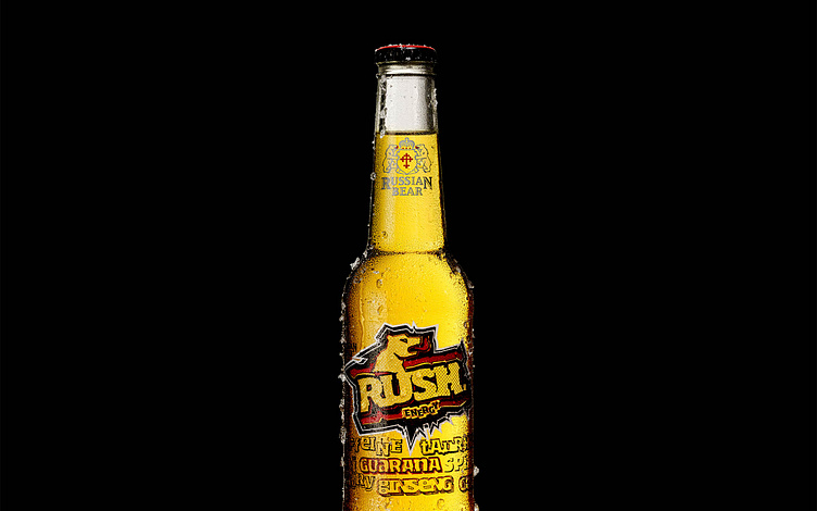
RUSSIAN BEAR // RUSH ENERGY DRINK
LOGO DESIGN // PACKAGING DESIGN // LABEL DESIGN // ART DIRECTION
The Brief //
Russian Bear Vodka wanted to launch an new alcoholic energy drink into the market catering towards the 18 -24 years target audience. The Client wanted a street edge, iconic style.
The Design Concept //
The logo design was aimed to appeal to the '20-Somethings' clubbers and students alike. We created an identity that had energy, impact and in-store recognition.
The Logo & Bottle Design //
The Russian Bear logo was recreated in an unique way as the icon.
Fresh fabricated typography coupled with glass decoration onto the bottle created a design that would integrate with the energetic liquid behind.
As you drink the bottle their are many little cue’s highlighting this integration.
The Campaign Posters & Billboards //
We wanted to push the concept of the combination of Vodka & the crafted ingredients of an energy drink into a simple word play. Just get there!
The Vending Machine // Events & PR
We created a vending machine that used special Rush coins, handed out from Promo staff to customers at events and Bar activations. Instead of waiting at the bar in a long queue for a drink, guests could take a coin and 'Get There' with a Russian Bear Rush.
Credits...
Agency: Young & Rubicam
Client: Russian Bear Rush
Creative Director: Clinton Bridgeford
Graphic Designer: Ryan Daynes
Art Director: Ryan Daynes


