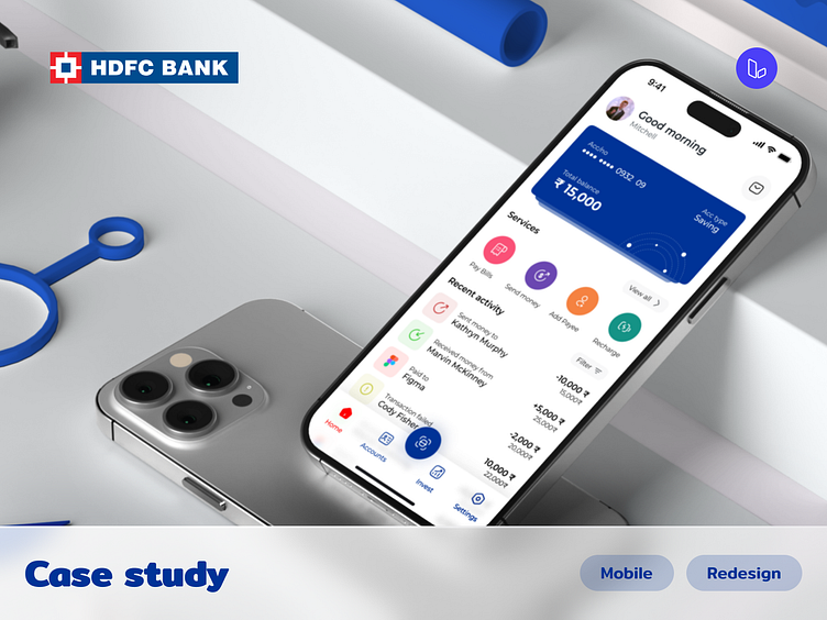
HDFC Mobile app redesign - Concept
Brief
HDFC is one of the biggest Indian bank
This case study is about identifying the problems users face while using the app and solving the problems by redesigning their mobile app
Goal
Give this app a new look and increase its user base by designing a better product with good usability and functionality by
making app navigation easier
Better information architecture
Problems
If a person has an account in HDFC bank, the account holder can use this app for transactions, UPI, Recharges, and many more. But this app lacks design and usability, so let's redesign this app so that the account holder can use this app as his primary app for all his transactions and eliminate the usage of a third-party app to transfer money. since now by using UPI ID and Qr code anyone can transfer money to any account or any app.
And app lacks in showing the recent transactions Only way to see the recent transactions is to open the account statement.
The Navigation of this app is pretty bad & difficult, and because of this users can get lost easily. Users have to take many steps to perform a single easy task.
The app lacks in communicating visually with the users and this can be reduced by using more colours and visual elements / UI elements like cards, carousals, bottom bar, etc.
By solving these problems users will automatically switch to the HDFC bank's app. Since users have the bank's trust in Security and Services it's a no-brainer for users to switch to this app. Through this number of users will increase and if users like the app they may refer this app to their family and friends so new users and new bank accounts will increase.
My process
I don't follow any specific process, I like to design the process according to the project based on the project type, projects specifications, and project goals
Since this project is about re-designing the existing app I did basic research and other stuff like personas and competitive analysis
Let's start redesigning 🖌️
Onboarding
The onboarding screen is really complicated with too many options like Shop (Yes Shop!), open account, login using a pin, log in using a password, signup, and add another user, etc. removing unnecessary things like Shop and other options will simplify the screens it will be easy to use
Home screen
Problems with the current home screen
1. Top bar
Let’s replace the current header with a simple header with an option to see important info like notifications and profiles and let’s remove the overview and favourite option since it's unnecessary.
and add a clickable multi-card so if users have multiple accounts, information is easily accessible without entering separate pages to see the information about different accounts.
2. Services
Let's replace the icons and move non-important and rarely used service options to view all services page. user can navigate to the services page by clicking on view all.
3. Recent transactions
After reducing and simplifying the services section there will be a lot of empty space so let's add recent transactions
4. Bottom nav bar
Now by replacing the hamburgers menu with the bottom navbar it's easy to navigate and see which screen the user is on and it will reduce 1 click.
previously on the hamburger menu, there are 9 options ( Profile, notifications, standard, home, pay, save, invest, borrow, and logout). So let's reduce this to 5 since we can't use 9 options in the bottom bar.
Profile, Pay, and Notifications options will be on the home screen.
User can see all their Account details on the accounts screen.
All investment-related options like save invest etc will be on invest page.
logout and other settings like notification settings will be on the settings page.
And let's add the Pay option as our main cell (CTA) in the bottom nav bar.


