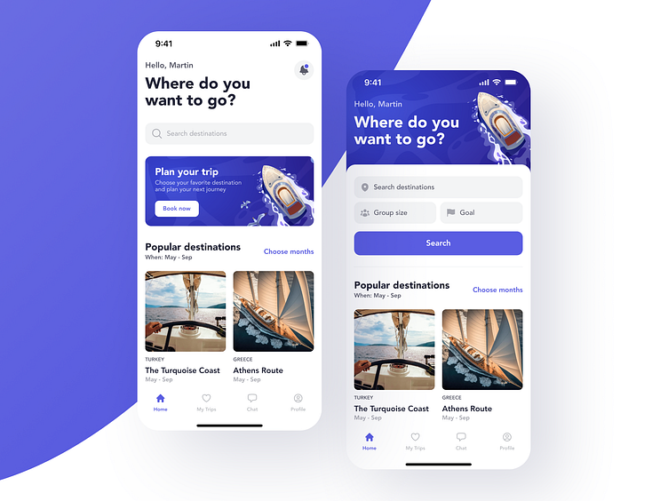
Yacht trips app | Main screen
🧭Navigation is key to every successful journey, and that is doubly true for user journeys. Ensure that they are never lost at the sea of options, or have to work out the entire path themselves.
Here’s an example: we’ve put the most important search categories on the main screen, followed by recommended routes, so that travelers have an idea where to start. Add a little bit of smart color use, and you will find your users steering confidently towards their destination.
Looking for a modern and user-friendly design?
✅ Book a call with our Founder
✅ Contact us here
More by Zoftify — Travel UI/UX View profile
Like

