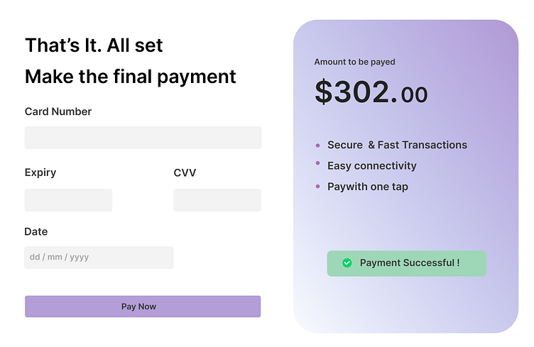
Credit card checkout page
Its day 2 and I created a credit card checkout page. I learned how to create gradients, blurs and dropshadow in Figma. It uses a simple design language with light colors and light fonts. I used purple colour palette for this.
More by Alfred View profile
Like
