Whash rebrand
Meet the new Whash!
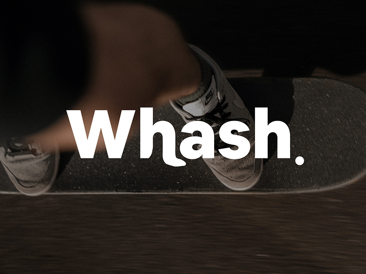
In this shot you can see the unique strategy behind the visual identity system.
— Sans-serif. Instills trust and friendliness of the brand
— Water ripples. Impression of water ripples texture recrosent the main materint used for washing shoes.
— Dynamic Proportion. Givings movement on the logo make it look more fun and alive
See the full project here: https://www.behance.net/gallery/175775237/Whash-Sneakers-dry-cleaning
---

⎻⎻⎻⎻⎻⎻⎻
What do you guys think?
Let me know in the comments section!
🫶🏻 Press "L' to show some love and to share your comments in the section below
📧 Have a project idea? I am available for
New Projects : karinasulim14@gmail.com
