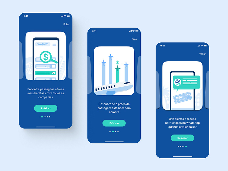
Flight Booking Mobile App Onboarding
Hello!
A top priority was to make the app easy to use since searching for flights and planning a journey can be overwhelming tasks. I chose a calm blue and green colors palette with hints of gray and black to create a simple yet captivating design. My objective was to provide users with an environment where they could concentrate on the task at hand without being distracted by unnecessary design elements.
Onboarding flow concept.
More by Felipe Soares View profile
Like
