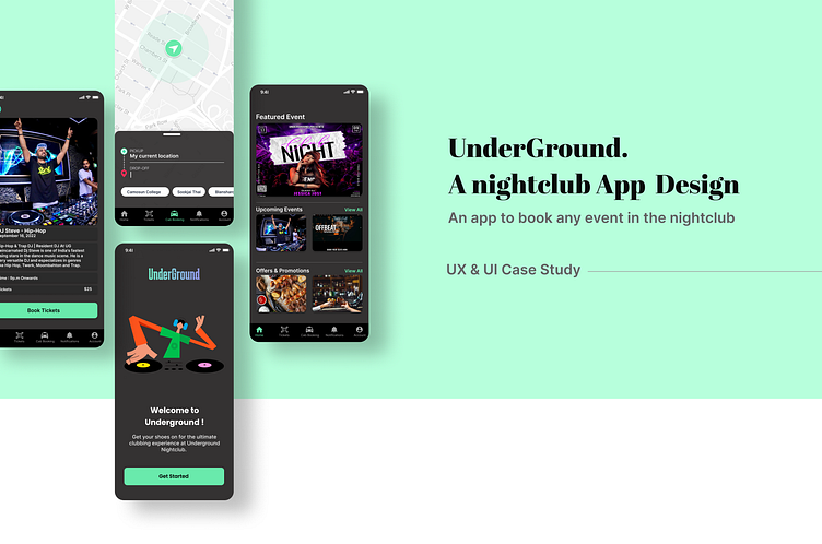
Nightclub App UX/UI Design with Easy Cab Booking: A Case Study
This case study showcases how I improved a nightclub app's user experience (UX) and design (UI) by adding a convenient cab booking feature. My goal was to create a user-friendly app that captures the nightlife vibe while ensuring hassle-free transportation.
Cab Booking Integration : Our standout feature is the smooth cab booking. Users can now easily secure a ride after their night out.
UX Research Insights: I started with research to understand nightclub-goers. They wanted a fun app and an easy way to book a cab for safe travel home.
User Journey Map
Ranveer's User Journey Map illustrates the comprehensive sequence of his experience, encompassing event exploration, attendance and the journey back home from a nightclub.
Starting the design
Paper Wireframes | Digital Wireframes | Low-fidelity Prototype | Usability Studies
Refining the design
Mockups | High-fidelity Prototype | Accessibility
UI Design Solutions:
I redesigned the home screen to highlight upcoming events and special offers instead of generic services. I have also added a simple cab booking tab for quick access.
Simplified Event Navigation: I made events easier to find by organizing them into categories like themes, genres, or artists.
Refinements Based on Feedback: Two rounds of user testing helped me fine-tune my designs. I have improved based on what users liked and what needed adjustments.
Click here for the prototype
Conclusion
Conclusion: This case study illustrates how UX research led to better UI design. My concept app now delivers a seamless nightclub experience with added convenience and safety through cab booking. My iterative approach ensures users enjoy their nights out while staying connected and secure.
What I took away from this project?
User Focus: Prioritize user preferences for a relevant experience.
Seamless Integration: Integrate practical features for smoother use.
Visual Hierarchy: Prioritize content for user engagement.
Simplicity Matters: Simple design aids usability.
Iterative Refinement: User testing improves design quality.
Holistic Approach: Cater to diverse user needs.
Adaptability: Embrace change based on insights.
Effective Communication: Showcase design decisions clearly.
User Safety: Responsible design promotes safety.
Continuous Learning: Stay updated to evolving trends.
This project deepened my UX/UI understanding and skill set.


