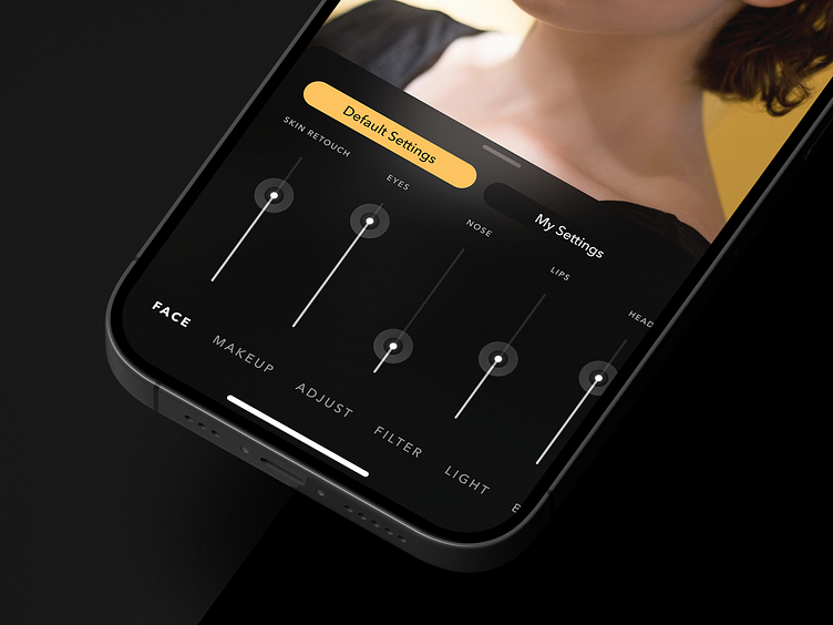
Sliders for the Photo Editor App
Hey there! So, I stumbled upon some of my old work, and you know what? I kinda liked those vertically arranged sliders. But here's the thing: that design's ancient history now! The app has evolved twice since then, so it's definitely not up-to-date.
I gotta admit, we tried using those vertical sliders in tests, and well, they weren't exactly user-friendly. So, my friendly advice: steer clear of 'em! Stick to a more user-friendly approach instead – horizontal.
Keep it fresh and rockin'! 🤘
More by Alex ✦ Borsuk View profile
Like
