An Intergalactic Design System Journey🪐
This project was created as a part of Dan Mall's amazing Scaling Design System course.
🎯Project goal
The objective of this project was to develop a design system capable of catering to multiple products within the same brand, offering both flexibility and scalability.
👀 A quick overview
3 new products: IPTS Travel, ipts.org and IPTS Rail, need to be powered by the same design system.
Creating wireframes, cataloging components & laying the foundations of the design system.
Extracting components from the designs & contributing them to the system.
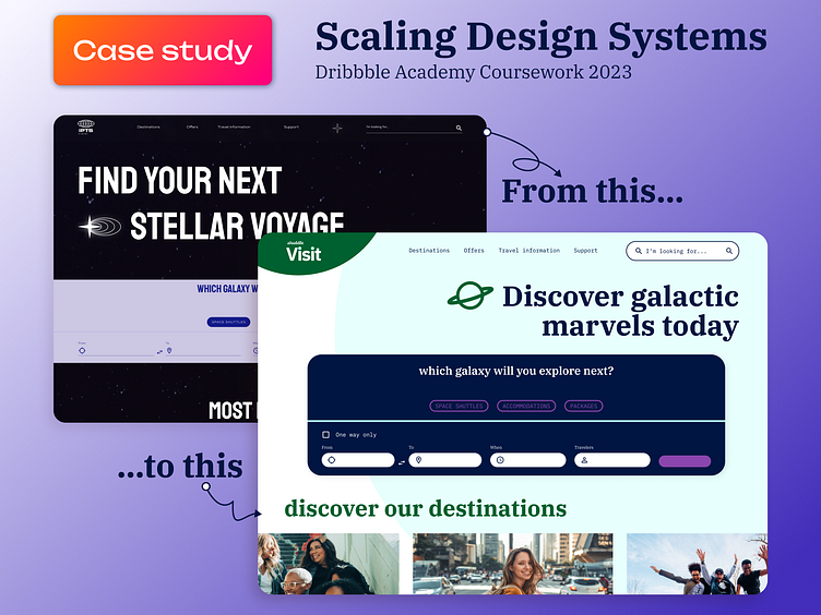
IPTS is rebranded as shuddle for a more youthful and approachable look.
The design system needs to adapt to the new brand guidelines & the products' visuals need to be refreshed. + Accessibility, guidelines, details.
Next steps.
🪛 My tools of choice
ChatGPT for content, Figma for wireframing & visual design, zeroheight for documentation.
🔍 Let's dive into the details
1. IPTS Products
ipts.org, an informational website where you can find the latest news and happenings with the IPTS.
IPTS Travel, a website where you can browse and book travel to and from multiple destinations within our galaxy.
IPTS Rail, a real-time updated web app where you can view lines, routes, and times for all the different commuter lines.
I used ChatGPT to give me suggestions for each site's content.
I refined those suggestions and customized them to suit my needs better.
You can see the outline for each site's content below. 👇
🏗️ 2. Wireframing & the foundations of the design system
I started with a few lo-fi wireframes to get a better idea of the components I'd be designing later.
At this stage I already started to think about the components' reusability and the most common patterns that appear on every screen.
These were the following (in the order of most common to the least):
Input field
Card
Header navigation
Footer
Button
They're going to be the base of my design system.
🎨 3. Contributing the components back to the system, from the finished designs
I built the pages based on the wireframes and the previously identified common components.
The base of the design system has been created by following the principle mentioned throughout the course. Always adding the components, which are currently present and needed in the designs and avoiding to try and predict the future. Utilizing the atomic design principles both on a component and a system level.
🚀4. IPTS gets rebranded as shuddle
The products have been rebranded under the new name “Shuddle,” which feels more like a cool, new startup.
The color palette is fresh and vibrant, and the identity relies much more heavily on photography of younger people to feel more welcoming and inviting.
The 3 main products have been renamed to feel more like a family of products instead of independent offerings:
“ipts.org” is now “shuddle.world.“
“IPTS Travel” is now “Shuddle Visit”
“IPTS Rail“ is now “Shuddle Ride“
📝5. The real test of the design system's flexibility
Having an already existing (even a visually significantly different) design system was immensely helpful when it came to updating the designs.
For example:
It streamlines the process.
Enhances consistency.
Ensures the effective application of the new branding to all design elements.
With a few font style and color changes, and minimally adjusting the graphical elements the old IPTS design system was easily transformed into the new shuddle design system.
It's definitely an investment that pays off in terms of efficiency, quality, and user experience.
Testing components & correcting inconsistencies
Even on a smaller level inconsistencies between screens and the system started to creep in.
So after a little break from working with the designs I came back with a fresh look on things, and cleared them out to keep the system neat and useful.
Accessibility
Tested the color contrast of components, and design elements to ensure adequate readability.
Also run the 'Color Blind' plugin in Figma, to check how well the designs would work for people with different types of color blindess.
Documentation in zeroheight
I started the design system documentation zeroheight.
Importing my existing components from Figma.
However the documentation is much more of a work in progress at the moment, I've started adding a few guidelines along the components and styles.
For example for the color usage:
📚Next steps for the system
If this project would ever go live, my next steps for the shuddle design system would be:
Continue the documentation
Sharing the single source of truth document with everyone
Onboarding team mates
Piloting the system on parts of the product & identifying issues, needed updates
Gather feedback for improvements, involve the community
Maintaining the system
Design system work is an iterative, never ending process, so many of the previously mentioned steps would repeat from time to time, and the design system maintenance itself would improve as we learn.


