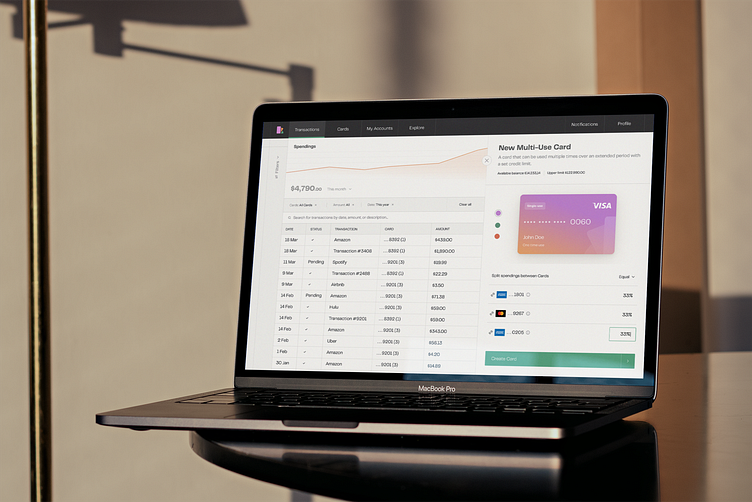
Fintech experimental UI
This time, inspired by our amazing partnership with Kasheesh (you can find the case study 👉 here), we decided to get creative and conduct an experiment.
We wanted to explore how the fintech interface could look like if it were centered around a more mature persona, striking a balance between approachability and seriousness. While the previous interface had a playful and whimsical vibe, we sought to retain a light and approachable look while toning down the playfulness to appeal to a broader audience. Our goal was to create an interface that is not intimidating and caters to both pro users and those who are new to fintech.
Shout out to the fantastic!
Design: Marta Stęgowska
_____________________________
Best way to stay updated? Follow Altalogy ✌️
Also, if you love it, press "L"🥳
We're available for new projects! Drop us a line at hello@altalogy.com


