Viator design system for a space tourism concept
Introduction:
This is the capstone project for Dribbble's Design Systems course Dan Mall.
Fictional brief:
As Head of Digital for the newly launched IPTS: the Interplanetary Travel Syndicate, a bustling transportation network that shuttles people from world to world within our galaxy, leadership has decided to launch 3 unique offerings, which are:
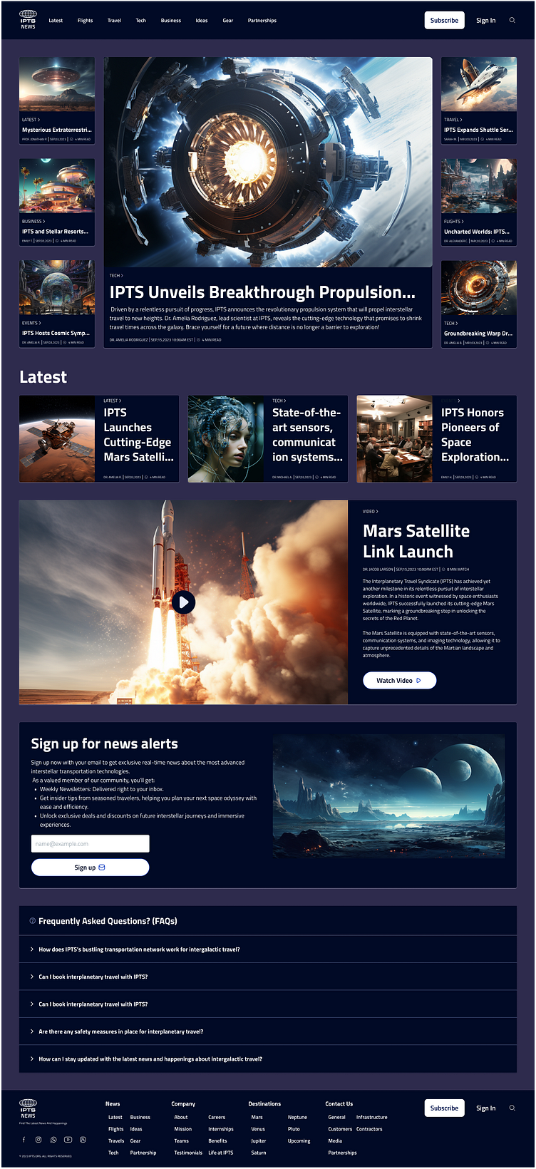
IPTS News: An informational website where you can find the latest news and happenings with the IPTS
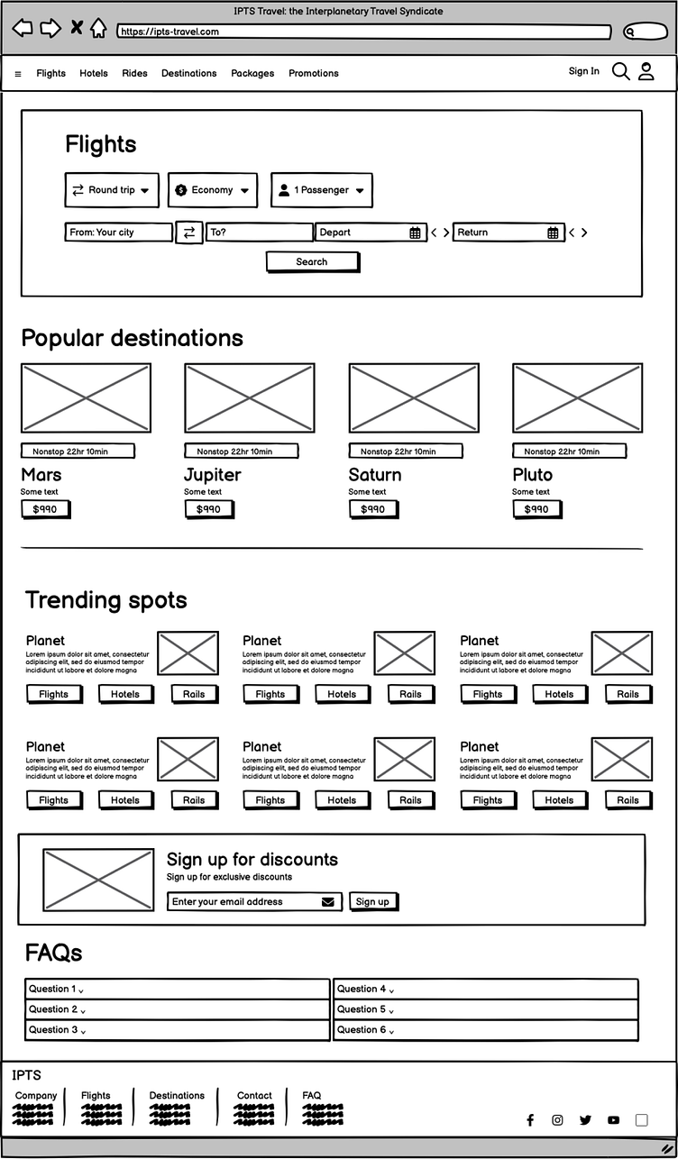
IPTS Travel: A website where you can browse and book travel to and from multiple destinations within our galaxy.
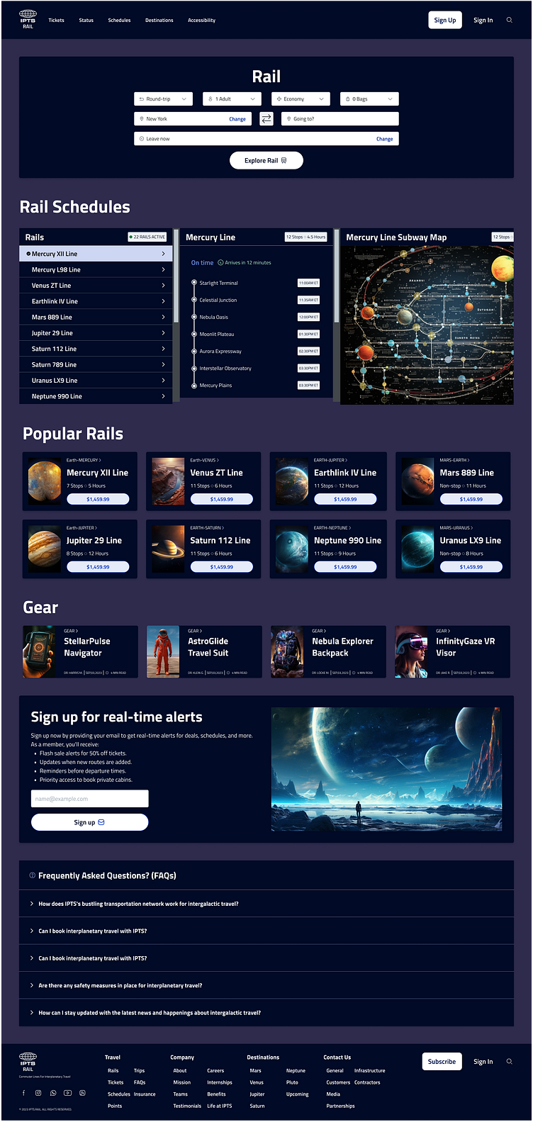
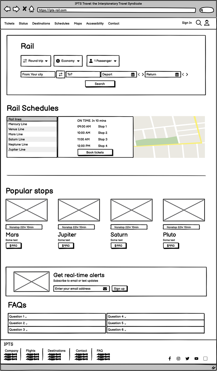
IPTS Rail: A real-time updated web app where you can view lines, routes, and times for all the different commuter lines.
Discovery:
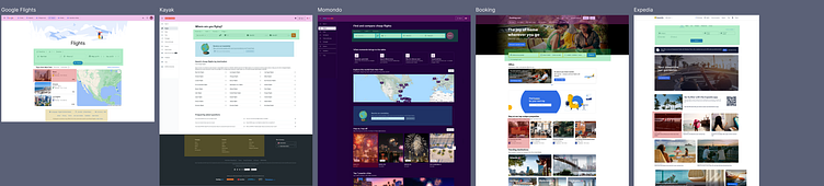
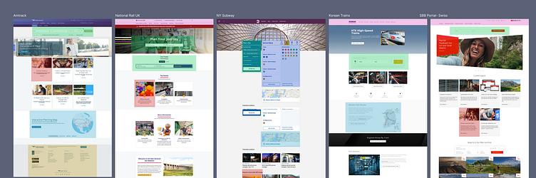
Initial work began with analyzing existing websites that offer News, Travel and Rail. I began with taking screenshots and highlighting common UI patterns so that I can use that to build out a robust set of components.
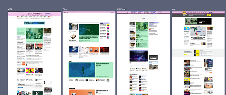
News components: News websites have a clear navigation, news cards, video cards, promotional material, and footers. I also noted that they had a 'Subscribe' or 'Sign Up' buttons. Most had a 3 column responsive layout.
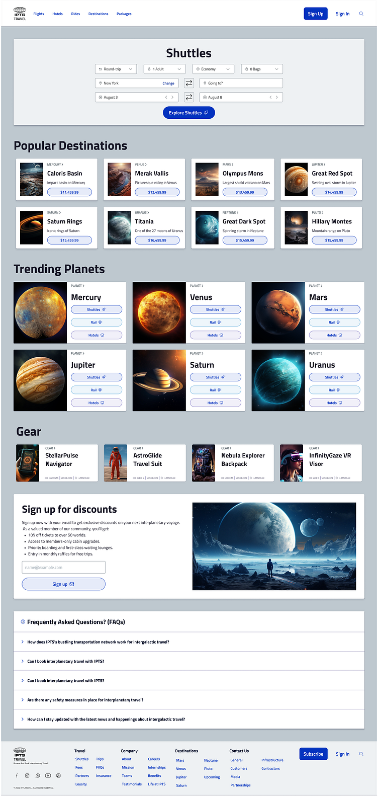
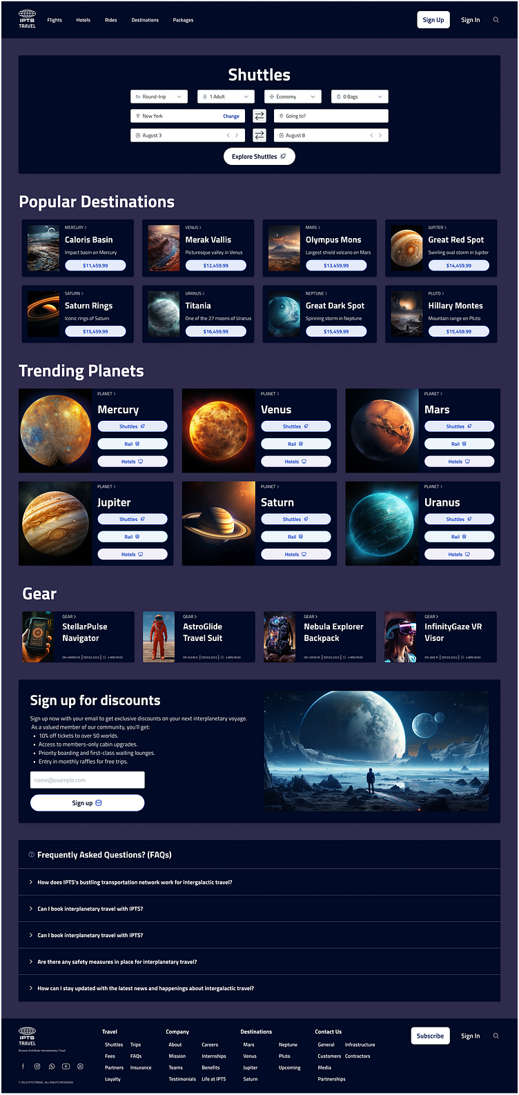
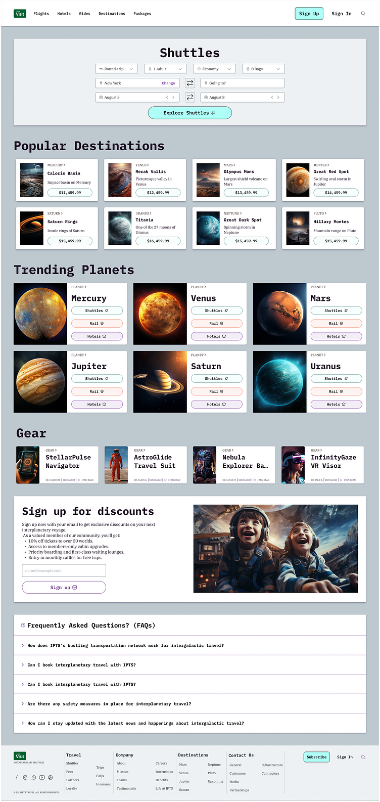
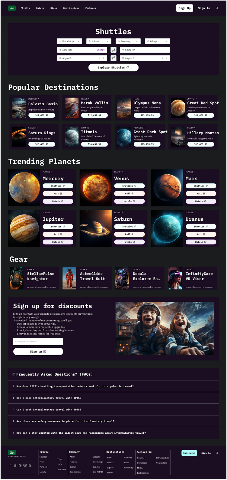
Travel components: Travel websites had a top header with links, a significant trip planner search component with date pickers and filters. Most also had trip deals and popular destination cards. They also had Sign up buttons and Footer links.
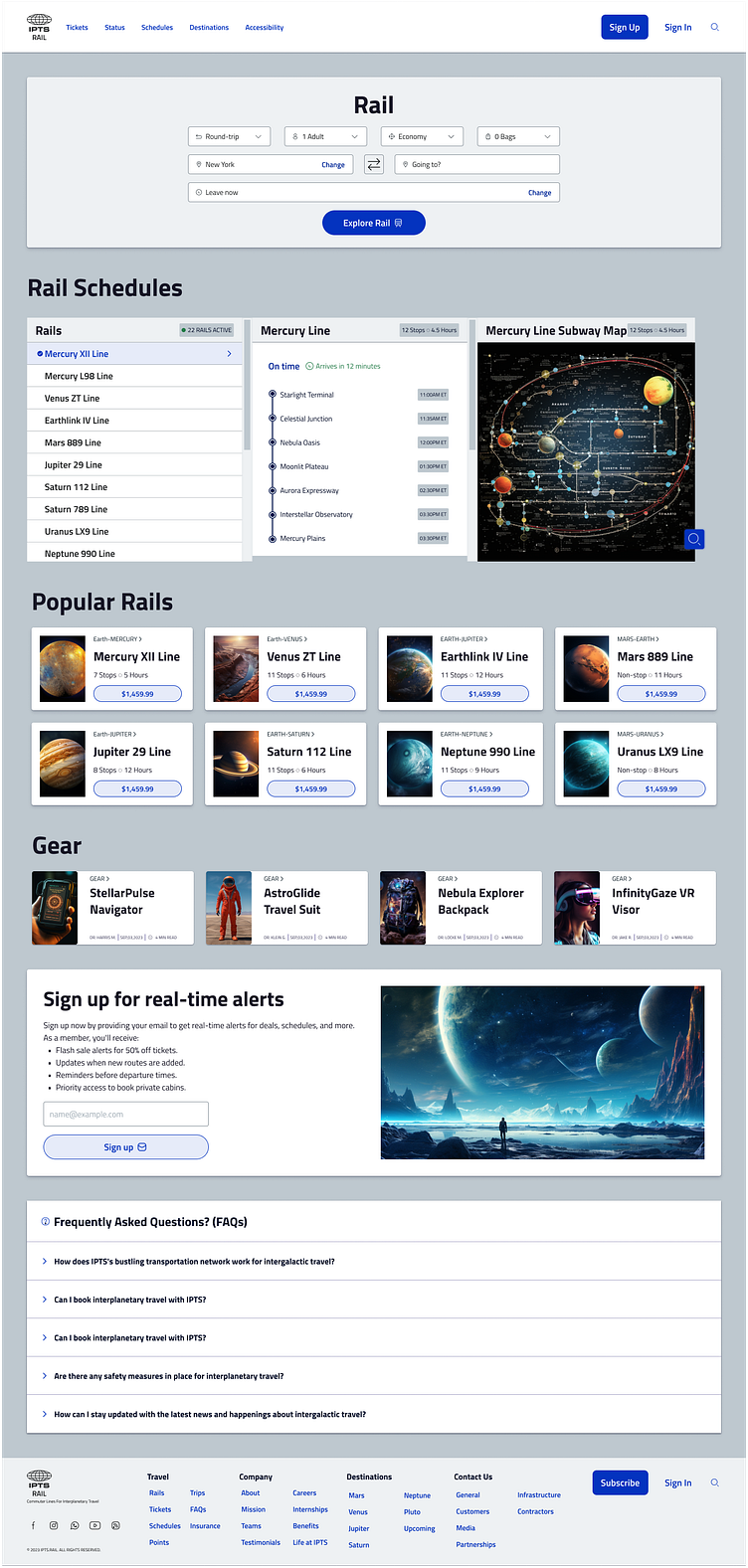
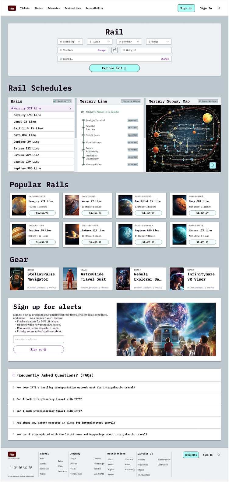
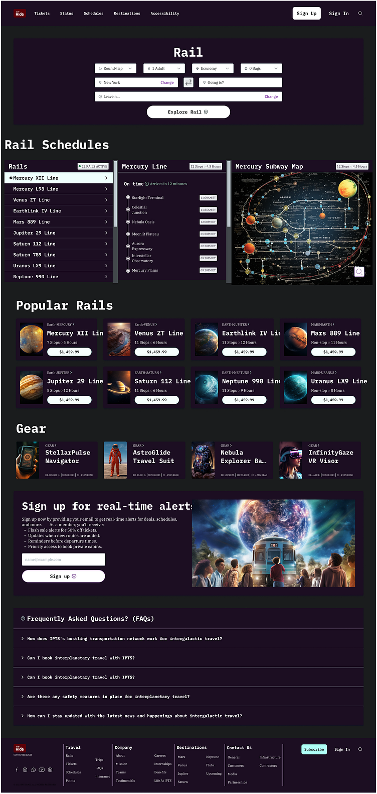
Rail components: Rail websites had similar patterns as Travel such as the trip planner component. It also included additional unique components. They are the status component, interactive planner and popular routes and trips.
Styles
I began creating the design system using atomic elements like color, typography, layouts, icons, elevation, and borders.
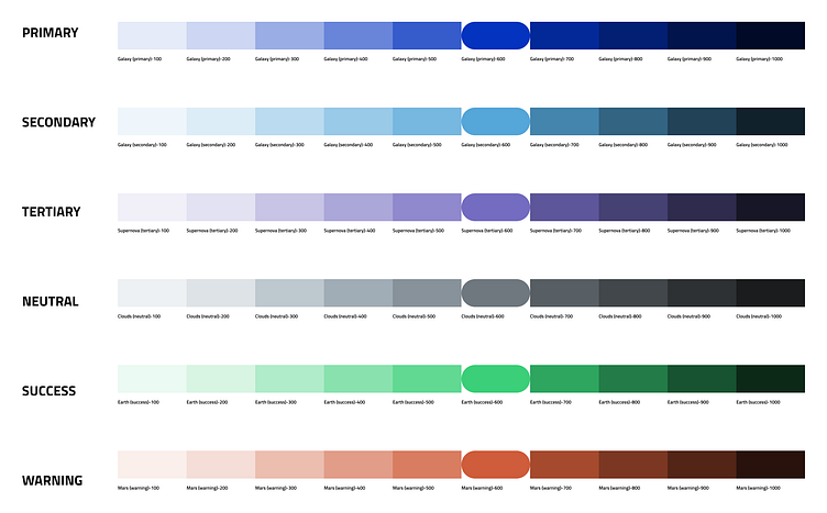
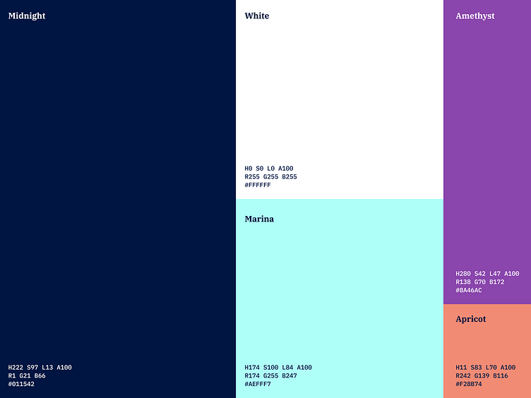
Color
I used a cool palette to stick with the space vibe. I used the Figma plugin 'Superpalette' to generate AA compliant color palette with primary, secondary, tertiary, neutral, success and warning.
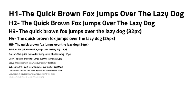
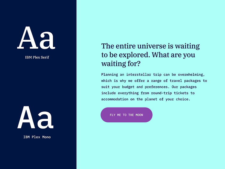
Typography
I used the font family 'Titillium web' as it is an open-source modern font that goes well with a futuristic product. The type scale was set up based on 8 point type scale used in many websites.
Grids
I created 3 grid systems for desktop (1440px width), tablet (744 width), and mobile (390 width). I used a 12 column grid for desktop with a margin of 48px and gutter of 24px. For tablet, a 12 column grid with a margin of 20px and 16px gutter. For mobile, a 4 column grid with a margin of 32px and 16px gutter.
Icons
I used open-source icon set available in Figma Community called 'Xnix Icon pack'.
Link: https://www.figma.com/community/file/1066305773644252559
Responsive design
Baseline
Desktop follows a 12 column grid with 48px Margin and 24px Gutter.
Tablet follows a 8 column grid with 24px Margin and 16px Gutter.
Mobile follows a 4 column grid with 32px Margin and 16px Gutter.

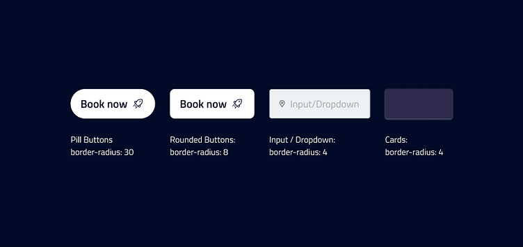
Themes
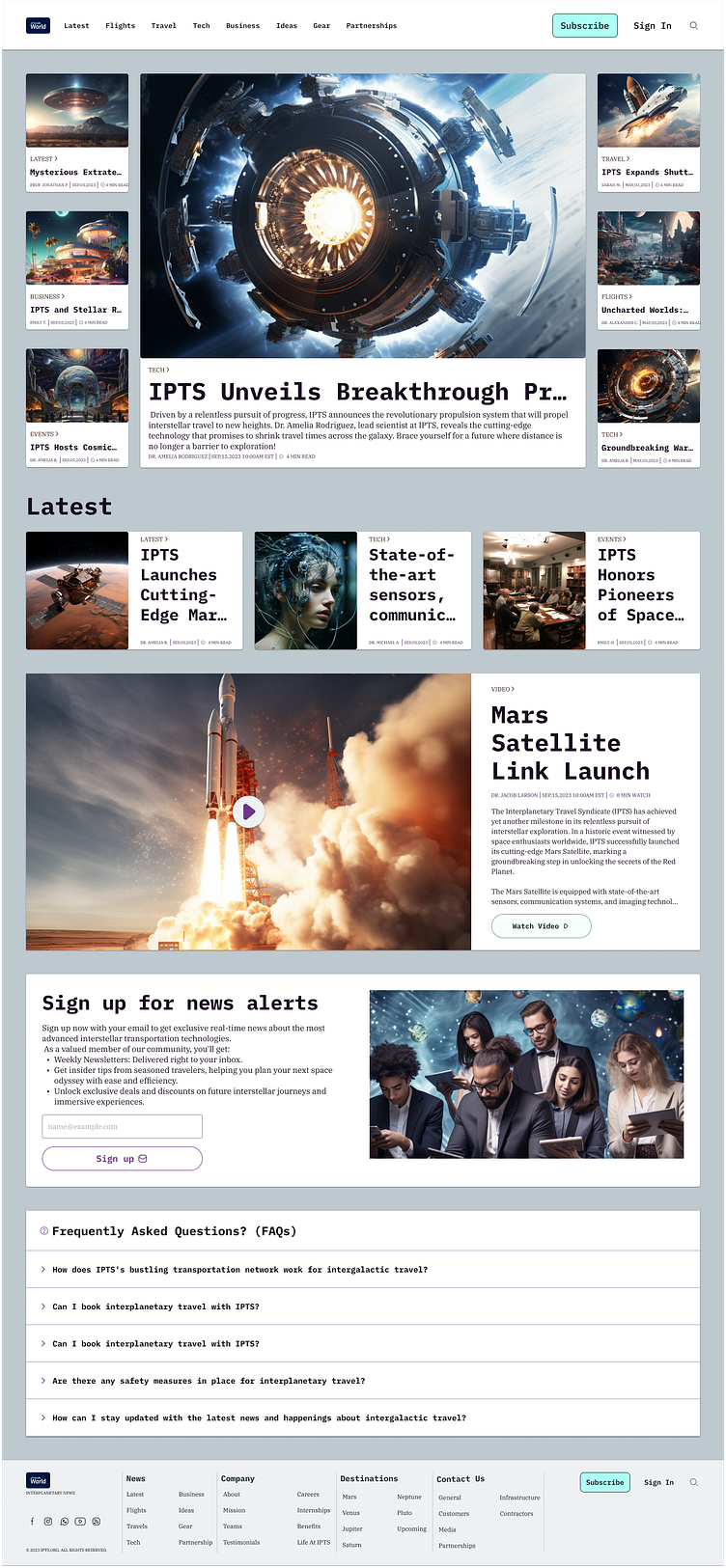
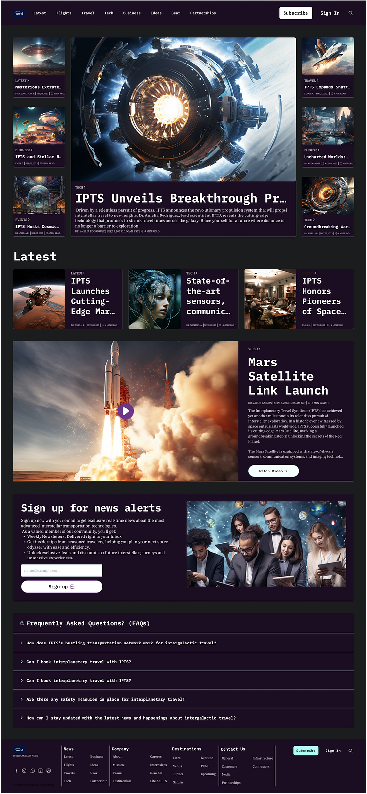
The design system supports a Light (default) mode and a dark mode. Examples below.
Light mode
Background-color: Moon (neutral)/300 #BEC8CF
Foreground color: System/White #FFFFFF
Dark mode
Background-color: Moon (neutral)/1000 #1A1C1D
Foreground color: Amethyst (secondary)/1000 #1C0E22
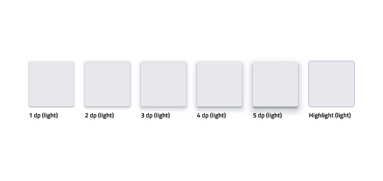
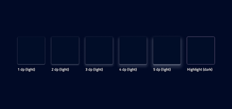
Elevation
I incorporated elevation principles based on Material Design. I created the following styles: 1dp, 2dp, 3dp, 4dp, 5dp, and highlight. The highlight style was created to indicate a selected field visually. I also created a light and dark version.
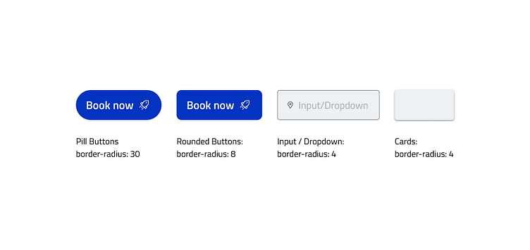
Border-radius
I made sure that there was consistency by including guidelines for using border-radius. I identified the following components that would use border-radius property like pill buttons, rounded buttons, inputs, dropdowns and cards.
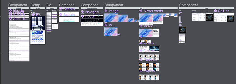
Components
Once the styles were finalized, I designed components to be re-used for the three web pages. I ensured that the all components adhered to styles created prior and have a robust and dynamic components with variants. I created the following components by first building out the basic atomic pieces and then scaling them to molecules. I created an accordion, buttons, dropdowns, search, navigation, cards and menus.
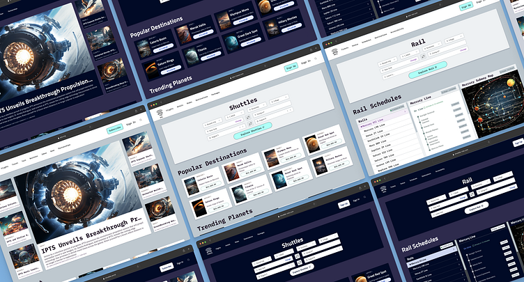
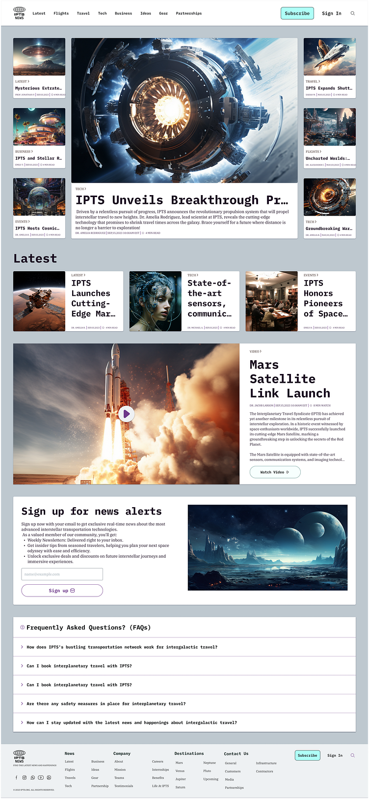
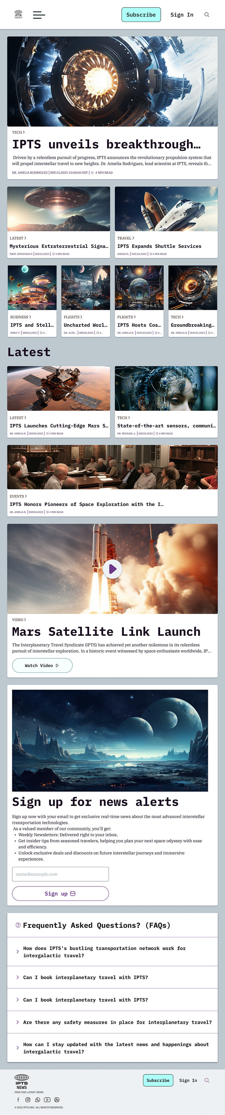
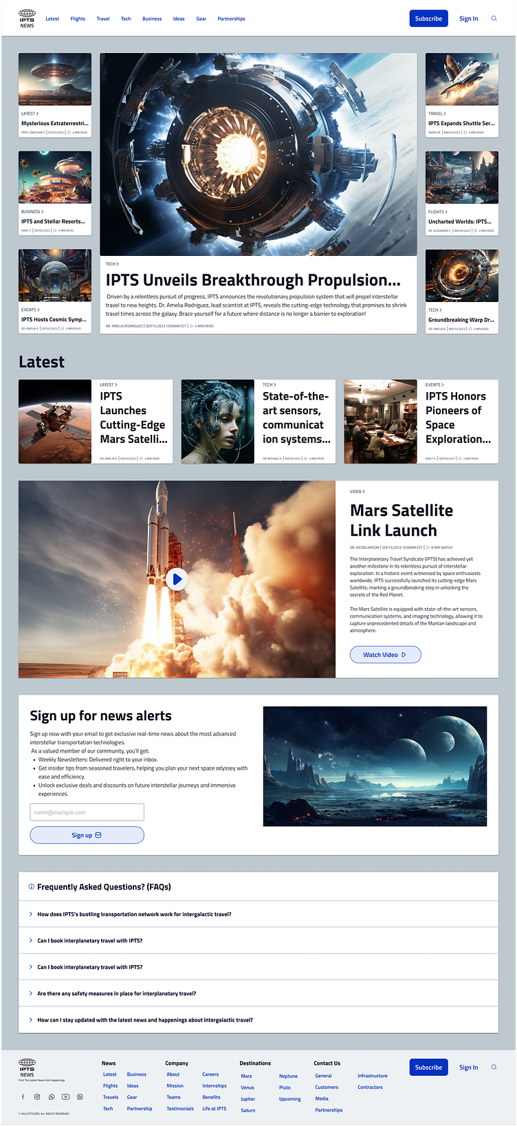
IPTS webpages
I created wireframes in Balsamiq Wireframes for the three web pages to get an idea of how the components will be used. I used the components created prior to replace the wireframe with the final visual design. I used Midjourney for imagery and ChatGPT for placeholder content.

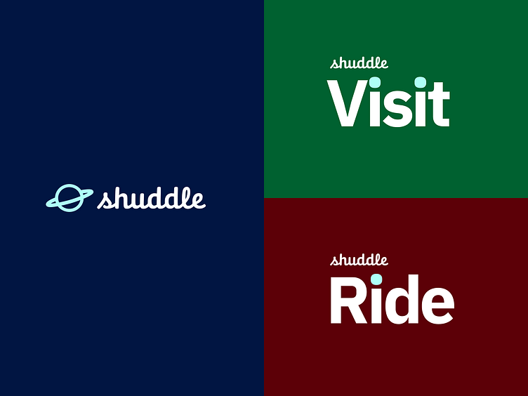
Rebrand
The capstone project had an unexpected twist when 'IPTS' was rebranded to 'Shuddle'. This meant an updated logo and styles that appeal to a younger demographic. The color palette was changed, typography was changed and the three offerings were updated to:
“ipts.org” is now “shuddle.world“
“IPTS Travel” is now “Shuddle Visit”
“IPTS Rail“ is now “Shuddle Ride“


Components
IPTS components were built using consistent, inherited styles. Once the rebrand happened I was able to quickly swap out the IPTS styles with the new Shuddle styles. The update cascaded to all components seamlessly.
I quickly understood the importance of setting up a design system properly from the start and how it can have critical downstream impacts.
Reference site
I created documentation for the components and chronicled my process in Zeroheight. I also provided a case study to show any designer who uses the design system to build a component using atomic pieces.
It is available for view at: https://zeroheight.com/1031af240
Figma links
IPTS (Version 1) Design System: https://www.figma.com/file/IjkOle9nZRLilukbD60Quw/IPTS--Viator-DS-v.01?type=design&node-id=138%3A8686&mode=design&t=HCsnOSHaaGjkiBPA-1
Shuddle (Version 2) Design System: https://www.figma.com/file/jMFL805YNqMnQxw70j2ioV/Shuddle--Viator-DS-v.02?type=design&node-id=138%3A8686&mode=design&t=4rEldSmSedNt8qcz-1
Conclusion
The course was eye-opening as it provided a comprehensive step-by-step approach to building a design system. I had the following insights.
Validate ideas early through low-fidelity design or code.
Always start with the base styles, as those cascade across all components.
Apply atomic design principles of starting working from atomic elements and building them into robust molecules.
Use ChatGPT and Midjourney to create content quickly.
Ensuring proper naming and semantics to remain organized.