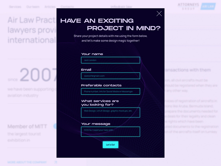
Pop-up modal for the website
Hello, guys 🖖
🥑 In the design of this pop-up modal I used brand colors and the visual hierarchy of the website. Such a bright stylization of the input fields was taken from the button hover effect to concentrate the attention of a user.
In the background, I put a geometrical abstract shape to create a volume of the composition. Types and text inside the input fields were chosen according to the marketing goals of this form.
The whole project you can see here 👉 Link
⬇️Stay tuned and subscribe⬇️
More by Dima Lytvyn View profile
Like
