Case Study: Scaling Design Systems - Capstone Project
In the "Scaling Design Systems" course led by Dan Mall, we embarked on a creative journey to develop three distinct websites, each showcasing a screen, for a fictional interplanetary travel company. Our challenge was to build a design system from the ground up, providing the foundation for these three sites while documenting our design decisions on a dedicated documentation site.
As the Head of design for IPTS, I've been tasked with designing websites for our 3 unique offerings that are launching soon:
The main website, ipts.org where you can learn and keep up with all things IPTS
Our travel website, IPTS Travel where you can browse and book your next trip to destinations across the galaxy.
And a web app, IPTS rail where you can view information regarding cargo transport.
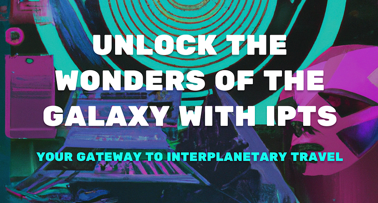
We were given only the logo, so I started with creating some prompts on ChatGPT to expand a bit more what information should be available on each of these sites. At the same time, I started exploring some visuals, and I decided to ask Dall-e to generate some sci-fi images based on Vaporwave effect. These visuals set the foundation for how I designed the look&feel of the 3 websites, witch each of them having a dedicated primary colour.
The 3 IPTS websites: ipts.org, IPTS Travel, IPTS Rail
Defining the UX
I opted for a simplified mobile version of the 3 websites.
The first website, ipts.org, presents the company and provides links to the 2 apps.
IPTS Travel allows user to book a interplanetary travel, giving also some predefined options.
IPTS Rail allows user to get real-time updates via tracking shipments or check schedule.
All three website have a similar header, except for the specific colour, as well as a footer that gives contact information and the option to sign up for a newsletter.
Rebrand
The leadership at the IPTS—the Interplanetary Travel Syndicate—just hired the prestigious branding firm MegaBrand to do a rebrand of the entire organization, and there are a few things that’ll affect the three products I’ve been working on.
Not only the logo has changed, but also the colour palette and the typefaces!
However, this is not an issue, since I've created a Design System in Figma to support possible changes.
Replacing the styles and components on Figma was a pretty quick job, and the 3 websites now look like this:
Conclusion
Setting up your component library at the beginning takes extra time, but it's a future-proof investment, in case of a rebrand like the one that happened during the Capstone project. It doesn't need to be 100% perfect, and certain elements don't need to be incorporated, if they're not used widely.


