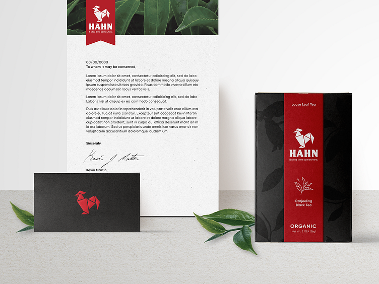
Hahn Tea Brand Identity
Hahn is a high-quality tea brand that showcases a fun and playful use of elements. I made the logo signature, business suite, brochure, and some package designs during the branding process. I started with a competitive analysis of the industry to learn the business's landscape and audience. I then established the company's mission statement and brand voice. Moving forward I was able to start working on the visual identity using the elements and research to back the brand’s look and feel. The logomark was heavily inspired by origami and the decorative tea bag folding started in Holland, combined with the symbolism of a rooster for the morning sun. (Hahn is German for rooster.) One important consideration was to ensure the logo had a flexible setup that would be easily recognizable and allow for both 2D and 3D applications knowing that package and 3D physical structures were to come. To see more click HERE.
