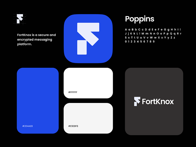
FortKnox - Brand Guidelines by @DoraDesign
Logo design
The FortKnox logo is inspired by the brand's core principles - simplicity and clarity. The icon combines the letter F from the name and a arrowhead as a reference that reflects the direction and positive dynamics.
Simplicity and minimalism are the key narratives that follow throughout the brand, and the logo itself is as simple as possible and at the same time coherent, built from simple geometric shapes.
About colors
The color palette is peaceful and futurism, consists of Sapphire blue, black, white and shades of gray, which once again emphasizes trustworthy, purity and minimalism.
This makes it easy to use and makes it flexible and versatile.
More by Rehan Raihan View profile
Like
