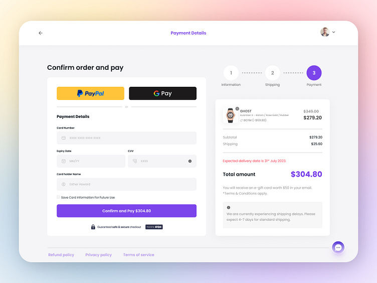
E-Commerce Checkout Page
According to research, 23% of shoppers abandon their carts due to lengthy checkout processes. When it comes to optimized checkout design, less is more. keep your UX user-friendly, your copy short & to the point, and limit the number of fields. keep it short and sweet! Here is an example of Conversion Optimized Checkout Page. Only the required info is asked and multiple payment options are provided.
The checkout process can be optimized according to your unique business needs. There are endless possibilities to enhance the customer experience. Keep exploring and improvising to accelerate conversions!
Project Queries: info@aliuiux.com
More by Osama Ali View profile
Like
