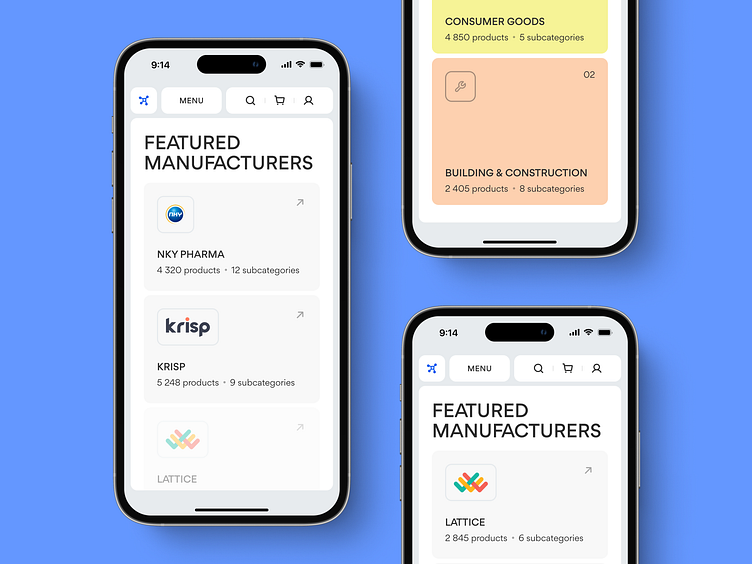
Mobile design details for a B2B chemical marketplace | Lazarev.
🔎 Let’s take a closer look at the interface for Matta mobile version.
Specifically, in the Categories and Featured Manufacturers sections.
Both help customers find products in a sea of offers, even on the go.
That’s what mobile design is for, right?
For the Categories section, we went for vibrant cards with icons and all the necessary information on the number of products and subcategories for users to explore 🙌
For those who choose to buy from specific companies, the Featured Manufacturers section is just the solution. We avoided any superfluous elements or icons that could distract customers. Instead, our design team kept the minimalistic interface and fused it with UX copy and the companies’ logos to catch users’ eyes.
There you have it.
How do you like our marketplace design?
Your feedback is more than welcome 💚

