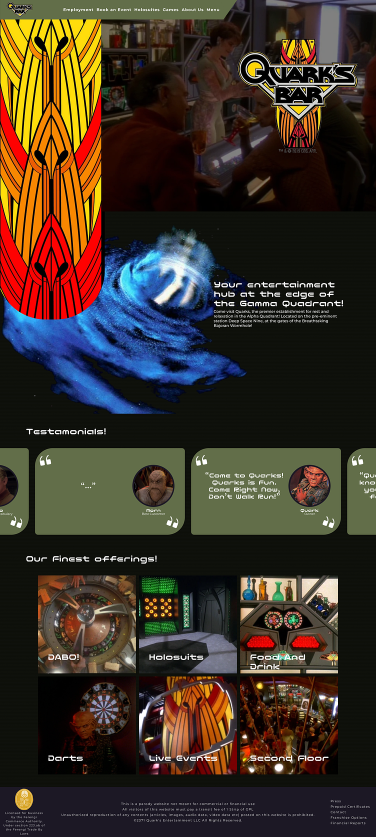
Quarks Bar Mockup Design
Week 1 of my personal challenge to post a UI Design or Mockup each week. For this week I went with one of my favorite shows on television for inspiration. What if Quark's Bar from Star Trek: Deep Space Nine had a website?
I went about making a basic home page for the website using Images taken from the show and the @memory-alpha website (Star Treks Fan Wiki). I wanted to keep the webpage simple for my first attempt using small levels of interaction, like the mouse over on the info cards.
One success I had with this design was the flag banner and the wormhole design. They tie the top of the page together well with a call to action in the middle
One disappointment for me was the testimonials section, I had wanted to have it to have more interaction either by having the cards fly in or move backwards but I couldn't find a style or animation that really worked the way I had intended
Thank you for taking the time to look at my design! I am going to use this weekly challenge I gave myself as an opportunity to continue to grow as a designer. To keep learning new skills, and to continue to enhance the designs I create!
