Paw Path - Dog Walking App - Case Study
Hey 👋
This project was built during my enrolment in Dribbble's Product Design Course with the goal of assisting dog owners in finding trustworthy dog walkers to walk their dog when they did not have the time to do it themself.
Problem Statement
In today's day and age a lot of people are really busy, and many of those busy people are dog owners. It can be difficult to find a reliable and trustworthy dog walker.
Understanding the user
To be able to design the best possible solution, the first step was understanding the user.
To do this I used the following methods:
User Interviews
During this phase it became clear from the interviews that trust, reliability and simplicity was really important.
Response #1:
“I wouldn’t trust a stranger to walk my dog, it feels more safe to ask someone i already know and trust to do it.”
Response #2:
“Someone I know I can trust, that I know will show up, every time.”
Response #3
“I would appreciate how simple it would make getting someone to walk my dog.”
User Persona
To understand the user even better I build out a user persona to get an idea of what type of person a potential user could be.
User Flows
At this point it was time to map out the flow of the application and match that with the research findings.
How it solves the problem:
The user can see the dog walkers before even creating an account reducing barrier-to-entry in terms of testing the app.
When the user/dog owner has found a potential dog walker candidate he/she can create an account and chat with the potential candidate and determine if it is a good fit.
Wireframes
Now it was time to start wireframing the solution based off the user flow.
Preparing for High-Fidelity Designs
After the wireframing phase, high-fidelity designs was up next. To do this and to make sure the designs maintained consistency, building out components and a style guide was crucial.
High Fidelity Designs
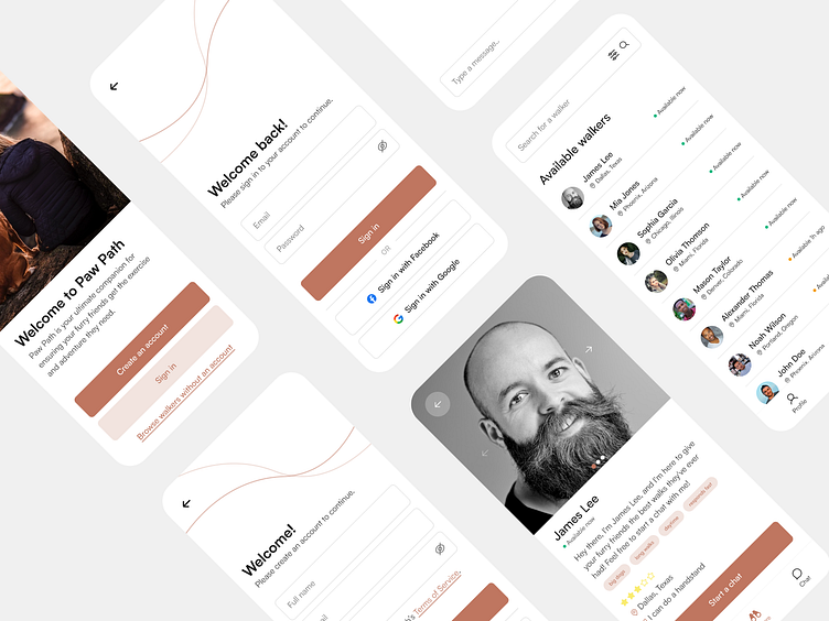
With a component library and style guide in place, it was time to start working on the high-fidelity mockups.
Usability Testing
After completing the high-fidelity mockups it had to be tested on users.
Feedback from users:
Trouble going back to the "Available Walkers" screen from a dog walker's profile.
The user has problems finding walkers in their area, missing a filter option.
Changes made because of the feedback:
Added a "go back" button on the dog walker profile screen.
Added a filtering option in the search field of "Available Walkers".
Below you can see the final designs after usability testing:
Thank you!
That was all! Thank you for taking the time to read the case study!


