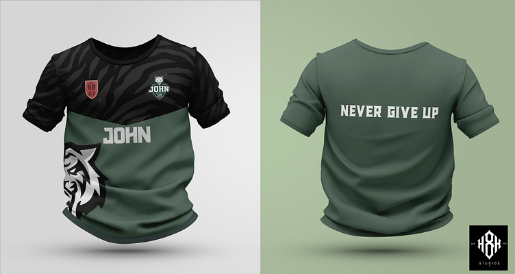
Minimalistic Jersey design
This concept takes in the tigers skin pattern to the top half of the jersey, I've used Black and green for contrast. The slogan is placed on the back of the jersey, to grab attention to the message.
More by Hammaad Rizwan View profile
Like
