Soda Packaging Design: Design from Sam's Club
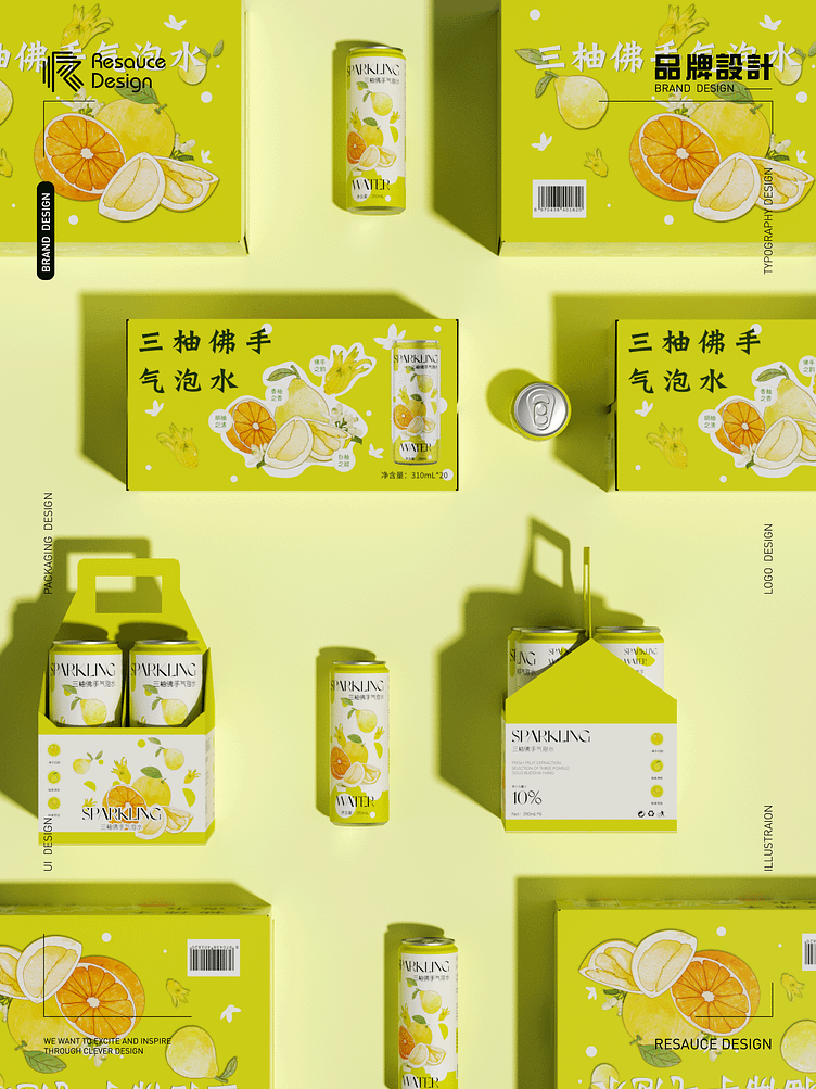
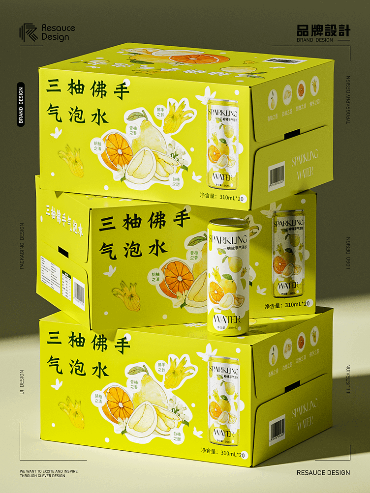
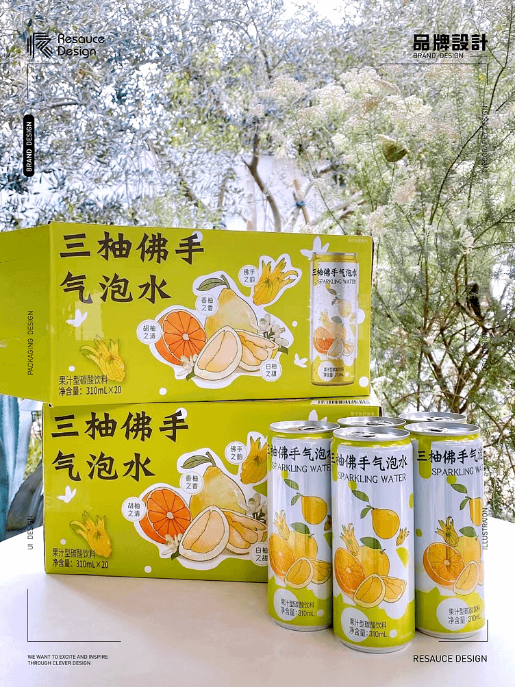
In the past year, while collaborating on packaging design with Sam's Club, the most significant takeaway for me has been adopting a shelf-focused mindset. With consumers having such fragmented attention, your presentation needs to be eye-catching.
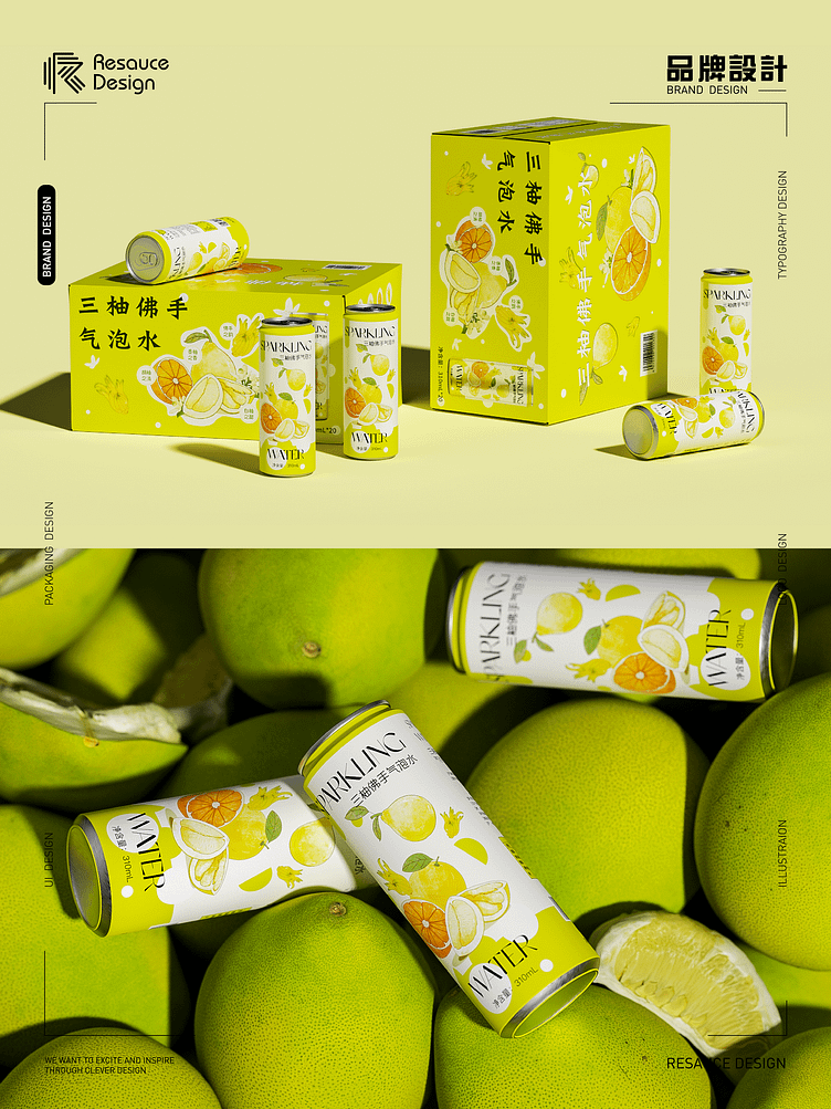
By using colors to convey product attributes and opting for vibrant and contrasting color combinations, we create a strong visual impact, ensuring that within the golden three seconds when consumers see the product, they immediately associate it with summer. Through design, we evoke emotions, allowing the refreshing feeling of "San You" (presumably a product name) to burst on the shelves.
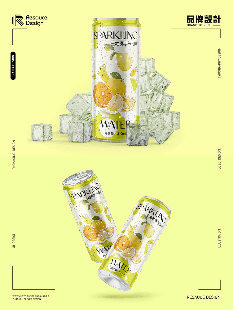
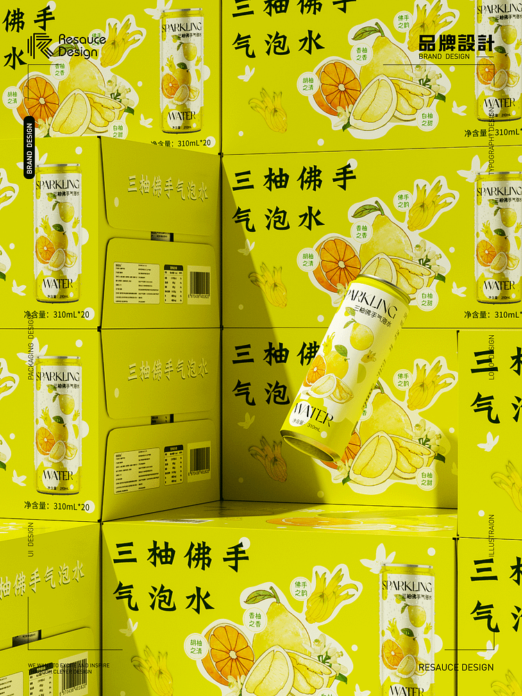
We utilize simple illustrations to depict the product's ingredients and flavors, fostering a sense of personal connection with the consumers. Coupled with trendy font designs, we emphasize the brand's youthful and energetic image.
Follow resaucedesign @Behance @Instagram @ Dribbble
Email us: rachelfinds10@gmail.com
Wechat us: resaucedesign