Rescuing True Back: A Brand Identity Journey of Alignment
#disclaimer I’m strongly in the mindset of only working on design that comes through the door of strategy, sometimes though I yearn just to give a client that can’t afford that something solid and simple to work from. This time I did.
Welcome to the journey of how a chaotic brand found its true alignment! In a gesture to reciprocate my chiropractor's help in treating a sports related injury, I offered to help him with his brand identity, which was scattered and lacked cohesion.
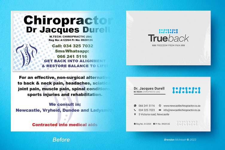
His business card was cluttered. Recognizing the potential for a quick win, I dedicated myself to crafting a simple and elegant business card design that would end up not only tidying up his brand but also set the foundation for a solid and simple visual identity.
💡 Brand Evolution:
🔹 Name Transformation: From mundane "Newcastle Chiropractor" to the resonant "True Back" - a name that speaks of both authenticity and alignment.
🔹 Streamlined Slogan: "Freedom from pain" - a simple, emotive phrase that perfectly captures their mission.
🔹 Refined Expertise To present his chiropractic practice as a specialized, high-quality service, I removed excessive modality descriptions and retained only his name and Chiropractic qualifications.
🔹 By subtly incorporating his Medical Registration and Practice numbers, we aimed to enhance credibility and foster trust.
💎 Symbolic Mark:
I created a new simple icon that symbolizes the spine and alignment.
🎨 Color Palette:
I formalized the color palette, anchoring it around "Cerulean Elixir Blue" as the primary color. This shade evokes feelings of trust and calm, avoiding the rigidity of navy blues. Paired with elegant "Slate Grey" for all other elements, the brand now feels sophisticated.
In addition to the main design, I also provided an option for a blue-on-black variation, adding a touch of X-factor and strength to the brand. The business card design is now coherent, carrying essential details without unnecessary clutter, establishing a theme that will guide the brand.
I had to achieve these brand wins in a remarkably short turnaround time, as I slotted this in between other paid projects and while I had hope to spend an hour on a business card. It turned into half a day but with so much value added


