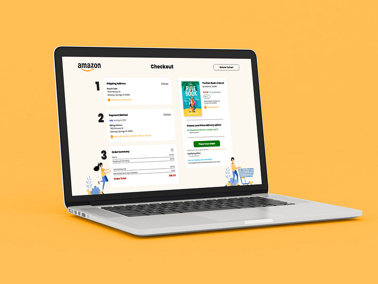
Amazon Checkout Redesign
My wife and I do a lot of ordering on Amazon, and I know we're not the only ones. When ordering, I've always thought, "Man, this checkout screen isn't the prettiest". It always blows my mind how big companies like Amazon can have such an outdated checkout experience. Yes, it's on desktop, and I know a lot of people are ordering on mobile, but come on, guys, you're a $1.3 trillion company. I think it's high time you diverted some funds to your desktop checkout page, huh?
Before
After
More by Dylan Wilkinson View profile
Like


