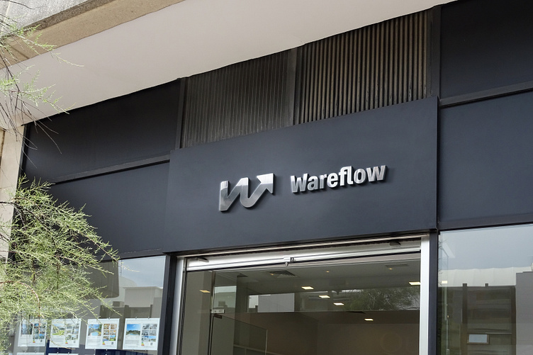
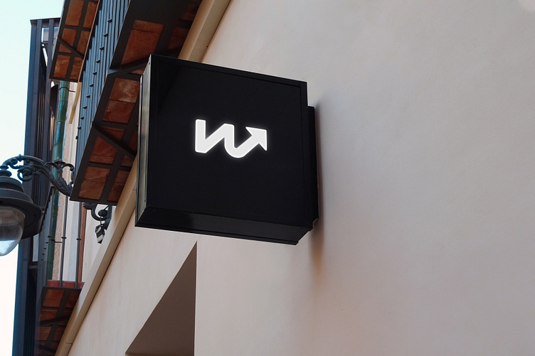
Wareflow logo design

The design journey for the WareFlow logo began with a clear vision - to encapsulate the essence of progress and efficiency in a visually striking emblem.

We sought to craft a logo that would resonate with users, conveying a sense of forward motion, seamless workflow, and success.

We envisioned the "W" transformed into a single thread of an arrow, symbolizing the unyielding drive and momentum that WareFlow brings to project management. This concept perfectly captured the essence of progress and innovation, reflecting our dedication to propel projects towards their goals.
As we unveil WareFlow to the world, we are excited to witness how this emblem of innovation will leave a lasting impact on the landscape of project management, empowering businesses to soar toward excellence and beyond.