Contact section
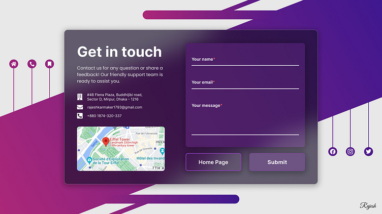
Background: The design begins with a light and dynamic half-background, where a captivating skew gradient color scheme takes center stage. This gradient evokes a sense of depth and dimension, transitioning seamlessly from one hue to another, creating an entrancing visual journey.
Appendices and Social Icons: Playful and engaging appendices are strategically placed, enhancing the overall aesthetic. These elements add a touch of whimsy to the design, drawing the viewer's eye and guiding them through the composition. Suspended above, a constellation of hanging social icons invites exploration, hinting at the interconnected digital landscape.
Contact Section: As you move further into the design, you'll encounter the heart of the Contact Page. Here, the atmosphere transforms into an exquisite glass morphism that exudes sophistication and elegance. The blueish-dark color palette creates a tranquil and immersive experience, reminiscent of a calm evening sky.
Text and Information (Left): To the left of the contact section, a well-organized and aesthetically pleasing arrangement of text and information awaits. This space provides essential details for connecting with you or your business. It's not just text; it's a roadmap to engagement and collaboration. Also contains a map for location to get in touch.
Contact Form (Right): On the right side, the bold section—an interactive Contact Form, meticulously crafted for both form and function. This form is designed to facilitate seamless communication, encouraging visitors to reach out effortlessly. Its alignment with the glass morphism background creates an intriguing juxtaposition of aesthetics and usability.
Designed in Figma by Rajesh Karmaker.
