Low-Fidelity Website Interface Design
Hey everyone! 🌟 I'm thrilled to share my very first attempt at creating a website UI design using Figma. 🎨 It's been an exciting journey so far, and I can't wait to show you what I've come up with!
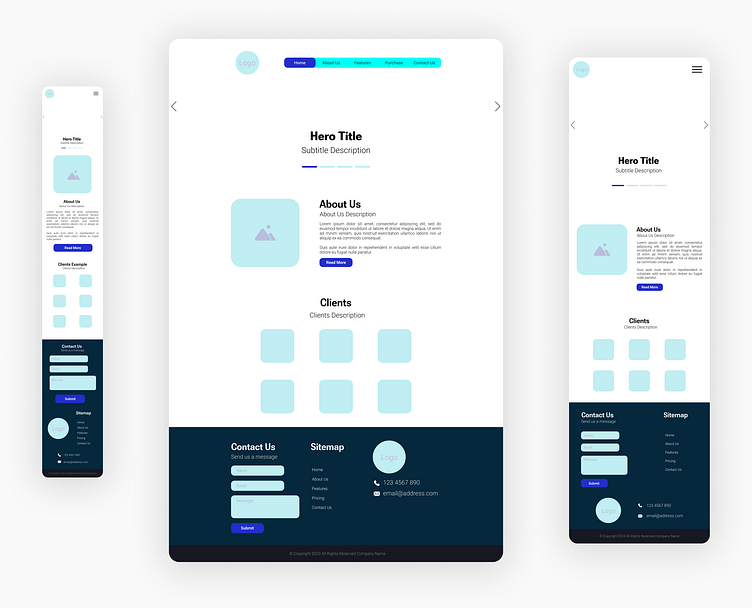
For this project, I decided to dive into the world of low-fidelity design. 🚀 It's a fantastic starting point for beginners like me, allowing me to focus on the layout and overall structure without getting bogged down in intricate details. 🧠
My design centers around a clean and straightforward user interface, ensuring a user-friendly experience for visitors. 💻 I wanted to keep things simple, with a clear navigation menu, bold headings, and ample white space for a modern and airy feel. 🏙️
Although the design may lack the finesse of more experienced designers, I'm proud of the progress I've made. 🙌 With every element I added, I couldn't help but imagine how the website would come to life, guiding users seamlessly through their journey. 🌐
I know there's still a long way to go, but I'm excited to share this early step in my design adventure with all of you on Dribbble. Your feedback and support mean the world to me, and I can't wait to learn and grow with each design I create. 📈
Thank you for joining me on this creative journey! Stay tuned for more designs as I continue to refine my skills and explore new possibilities in the fascinating world of UI design. 🚀🎉
