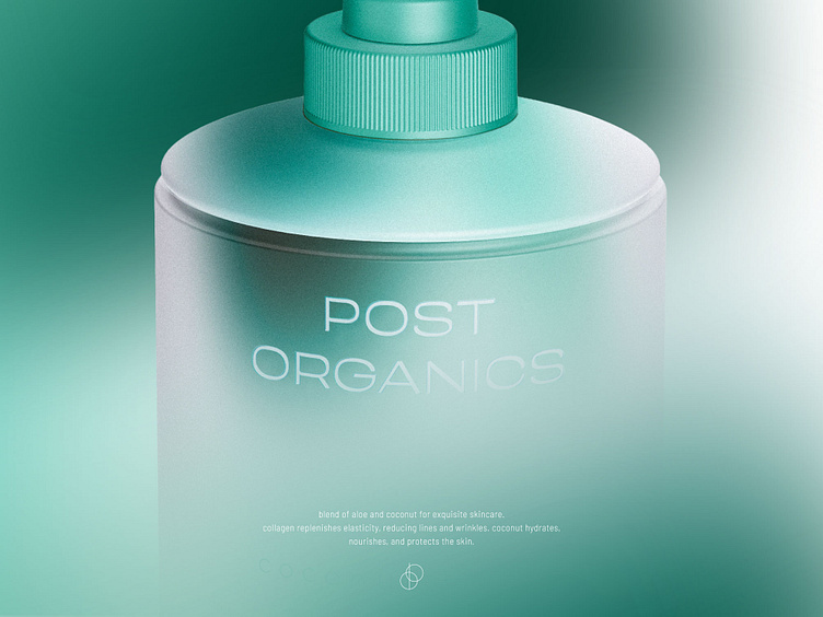
Post Organics / Brand Identity / Package Design
Sup guys ⚡️
Introducing my latest portfolio case—a groundbreaking visual identity and package design for Post Organics cosmetic.
Genuine approach forms a compelling brand story that deeply connects with mindful customers, enhancing the skincare experience to unprecedented levels.
Stay tuned to see a new shots from this project ✌️
Feel free to comment / critic / love ❤️
⚡️ Need a brand identity/website or whatever else? zmiydmitry@gmail.com
The visual style beautifully balances organic elements with a touch of sophistication, creating a top-level appeal.
The typographical style embraces an utilitarian medicine production aesthetic, harmoniously blending functionality and elegance.
That brand stands apart by eschewing greenwashing and superficial organic claims. Instead, it focuses on a workable formula with a clear purpose, incorporating organic ingredients only where they truly enhance the product's efficacy.


